
Batman Incorporated #0 Review
Story: Chris Burnham and Grant Morrison
Art: Frazer Irving
Review by David Short
Man, was this not what I was expecting. Not the story– which was right on par with my expectations– but the art in this book was a complete shock to the system. We’ll get to that later though. It’s not often that I get excited for a cover in comics today, but seeing Knight and Squire made me overly excited for this book. They were two of my favorite characters from the pre New 52 DC landscape. With some of my other favorites ret-conned out of the universe entirely (Stephanie Brown), or regulated to light duty (Booster Gold), I was just glad to see that they were still around. More importantly, they still look to play a role in Morrison’s epic.
While it was great to see the second best dynamic duo in DC Comics running around helping the Bat, this issue plays out not too different than any other team building (insert team building experience here). What you have here Ocean’s Eleven with Batman. Which is great, don’t get me wrong, but it’s old. Especially with so many different teams running around comics today, it’s just not something that will get me excited any more. There are some great moments in the recruiting process, most of which showcase the British Bat family, and some classic Grant Morrison humor in others. This is a good refresher to the players that will be involved in the events to come, but retreading waters that most of us have read if you’re up to date on Batman Inc.
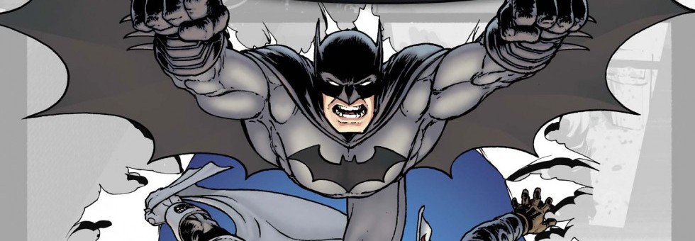
Chris Burnham really blew me away with the third issue of this series, but with #0 he took to helping Morrison concoct the origin story. Enter Frazer Irving. Irving’s style is drastically different than Burnham’s. Really, it’s different than anything I have seen before. His style reminds me of digital work. It doesn’t look hand drawn, but it’s still gritty. The backgrounds are really amazing, and the way he uses color is fantastic. The backgrounds are so good, that it makes the times he drops them out all together more noticeable. It makes the panel look very bland compared to the panels with elaborate backdrops. The book looks gorgeous when people are in costume, or when things are in motion, but when focusing on ordinary people things get…weird. Things just look off. Faces are detailed, but at the same time, lack detail. Things don’t look natural. It’s tough to put into words. It’s not like anything I have seen before. It really turned me off when people weren’t in costume.
Verdict
This is a good crash course on the players in Batman Incorporated. Morrison and Burnham keep things fast paced and fun, and Irving fills in well (despite what problems I have with his style). Though, put Knight and Squire in anything, and I will buy it immediately. Read it for them alone, and then write letters to DC asking for a book featuring Britain’s finest.