Paper Girls Vol. 1
Written by: Brian K. Vaughan
Art by: Cliff Chiang
Colors: Matthew Wilson
Letters: Jared K. Fletcher
Review by: Shane Boyar
EDITOR’S NOTE: This is a review of the complete first arc. This does not include a review of any special features of extras that may actually be included in the TPB.
 We live in a post-Saga world. Bearing that in mind, I really want to do my best to not review writer Brian K. Vaughan’s newest ongoing series Paper Girls in comparison to what is arguably one of the most popular and lauded new comics of the past 5 years. But man… he really makes it hard when just two pages into the first issue there’s a guy with a screen on his face displaying a shot of the Challenger exploding. We’ll just chalk it up as an Easter egg for his loyal fans and move on though, since it’s at that brief nod to Prince Robot IV where the direct similarities to Saga end.
That isn’t to say Paper Girls isn’t immediately recognizable as a BKV comic, in fact this might be Brian K Vaughan at his supreme Brian K Vaughniest, so much so that I had to stop midway through the 2nd issue and wonder if maybe he was just messing with us this time. We’ll get back to that in a second though.
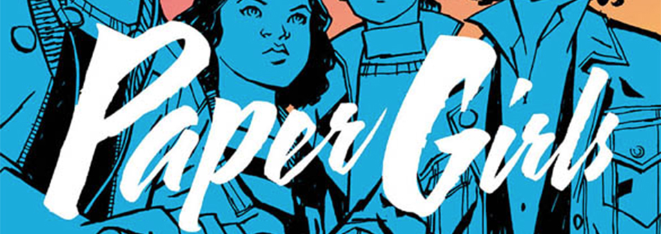
I want to talk about Matt Wilson’s colors for a bit. Over the past couple years, Wilson’s name has been popping up more and more often in the credits of the books that make up my pull list. It wasn’t until I saw his work in The Wicked + The Divine, that I made it priority to check out more of his work. After seeing his work with Russell Dauterman in the 2014 relaunch of Thor, he cemented himself in my mind as one of the best colorists working in comics. Now, Paper Girls feels like his opus. Paper Girls takes place in 1988 and Wilson’s palette, made of a wide range of pastels, fits the setting perfectly. The vibrant hues of blues that make up most of the first issue, when the eponymous gang of girls are riding their bikes around their neighborhood in the Cleveland suburbs gives the comics a dreamy and whimsical feel that really sets the groundwork for the unbelievable events to come. Where Wilson really shines in Paper Girls, though, is when he gets a wide swath of sky to take his brush to. Made up of purples accented with hot-pinks, it’s a sky that shouldn’t be, but works perfectly and instantly feels familiar. Another moment where Wilson really shows his expertise is during Tiff’s “flashback” in the 4th issue. Wilson uses color blocking to show the passing of time as Tiff spends her whole life playing what looks like NES’s Arkanoid. The scene lasts over 4 pages and I would have been fine had it been the whole issue.
Cliff Chiang, who skyrocketed to popularity through his work with Brian Azzarello on the highly acclaimed 2011 Wonder Woman run, lends a style to the series that effortlessly combines styles that are both irreverently cartoony and yet somehow grounded in a sense of realism. His characters feel very human (except when they’re not), and their sense of movement perfectly matches the near-frenetic pace of the storytelling.
As far as Paper Girls lettering goes, there’s a common saying in the comics industry that if a letterer has done their job correctly that you don’t even notice the letters on the page. Normally, this holds true, but then there are the rare instances where the letterer’s work actually elevates a scene, acts as the perfect finishing touches that really make a read stop and pore over a page. Jared Fletcher does just this. At all the right times he does the job at hand and stays out of the way of Vaughan and Chianng, but then comes a moment like right near the end of the first issue where Mac, the leader of Paper Girls, is panicking and her words are so frantic that there isn’t enough room in the speech bubble to hold them all. They don’t bleed out but seem to continue beneath the art, for how long is left to the reader’s imagination. Fletcher’s skills as a letterer are evident, even with dealing with a made up alphabet… Which leads us back to Vaughan.
It’s become evident that BKV is fascinated by language and technology. In Saga, the characters from the moon planet of Wreath speak in a language called Blue which is close to the real world language of Esperanto, a language invented to be politically neutral. In We Stand on Guard, the French Canadians actually speak throughout the comic in Quebecois (though Vaughan has admitted he’s had to bend the language a bit to be more readily recognizable to non-French-speaking readers). In both series the languages represent something more than just words. They are fundamental to the characters speaking them. Now in Paper Girls we are presented with two new languages, one that looks like an alien form of Chinese and leaves it to the reader to decide on how it sounds, and one that sounds like a bizarre blend of Shakespearean English mixed with the modern day vernacular of the American Teen, the meaning of which can just barely be sussed out given some effort.
In fact, just like the language, there isn’t much that has made itself readily clear in this first arc of Paper Girls. All we know is that there are monsters that look like giant Pteranodons, socially progressive time traveling teenagers with mysterious deformations and augmentations, futuristic paladins, a strange creature called an Editrix that makes your life literally flash before your eyes, and some old dude who is a fan of Public Enemy maybe calling the shots. The Girls are being thrust into a generational conflict that crosses time and space, and with any story of time travel comes a set of rules that needs to be established. Have you ever seen the movie Primer? Events taking place in the fifth and final issue of the arc seem to think the rules here will be similar to the ones in the hard-to-follow indie flick, but here’s to hoping BKV can keep it all in check.
VERDICT
It’s a lot to take in over just 5 issues, but with a creative dream team like the one Image has gifted to us with this series, and a elevator pitch that is “Stand By Me meets War of the Worlds” there’s no other verdict for Paper Girls than BUY IT.
