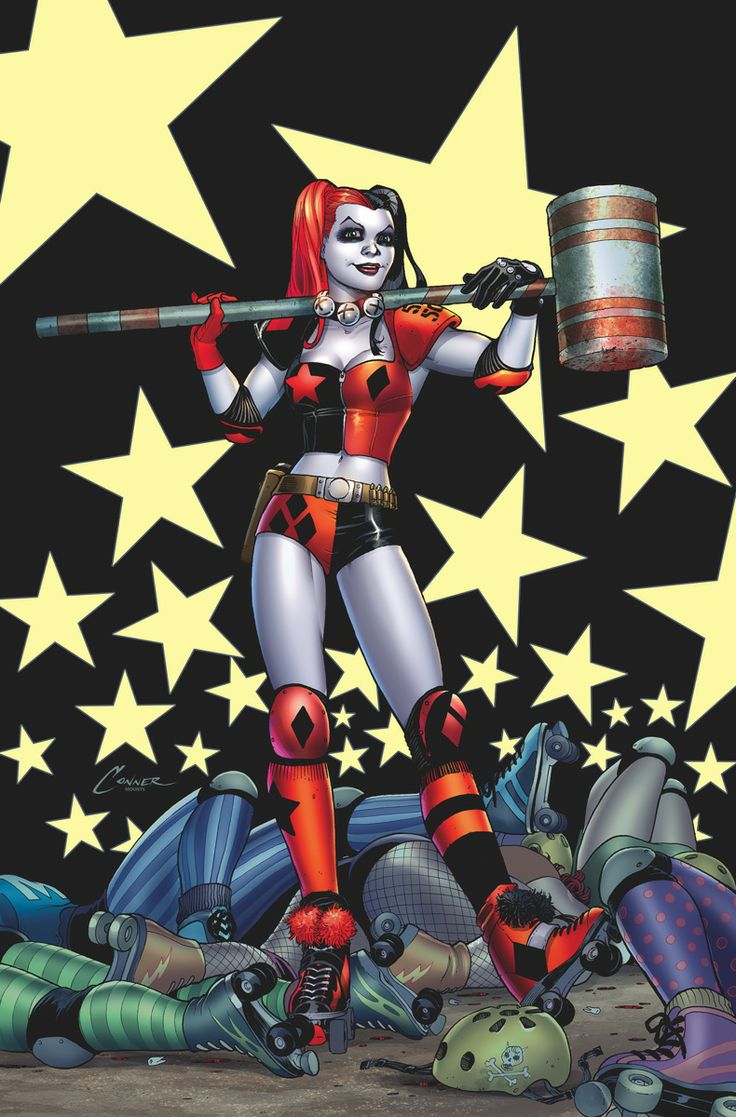
Harley Quinn #1
Written by Amanda Connor & Jimmy Palmiotti
Art by Chad Hardin
Colors by Alex Sinclair
DC’s mainline “New 52” books get a lot of flak at times for either lacking the fun or being too dark. This is definitely one advantage that Marvel has over DC, but with a book like Harley Quinn on the shelves it looks like DC may be able to recapture some of that lost fun.
 The new series sees Harley Quinn moving to Coney Island and taking up ownership of a building. Both the slice of life aspect and even the idea of the protagonist acting as a landlord are eerily reminiscent of Marvel’s Hawkeye. I like what Palmiotti and Connor are playing at here. Marvel often takes little potshots at DC in the pages of their comics, and it is nice to see that DC is loosening up a little and returning the sentiment.
Being a book about Harley Quinn means the normality of everything is left behind to make room for some absurdity. Harley has a talking beaver (no this is not a euphemism) that is the Hobbes to Harley’s Calvin. Connor and Palmiotti used the beaver in a way that allowed for the absent of thought boxes and for the excess exposition found in many first issues to be hidden amongst the dialog of Harley and her projections. The beaver is someone that can comment and respond to Harley and gives a look into the inner workings of her psyche and just how broken she is. I have to admit though, that most of the jokes from either Harley or the beaver fell a little flat or felt slightly cliché. I was expecting a little more hilarity from Harley Quinn.
Connor and Palmiotti have certainly given Harley a lot to do, and this has opened the doors for her supporting cast to start growing beyond conversations projected on to animals. What looks to be the overarching conflict of the next several issues is presented subtly throughout the issue, but builds to a startling and confusing revelation for Harley.
Hardin and Sinclair are what really have me wanting to come back for the next issue. Hardin provides a very cartoon look to the panels and Sinclair uses bright, vivid colors that really pop off the page. On my retina display iPad they look gorgeous. With some of the closer up shots of Harley, there is an extra level of detail and shading that adds even more beauty to the work. It even adds to the cartoon feel by reminding me of some classic high level zoom shots from cartoons like Droopy or Ren & Stimpy.
The Verdict
If you are a fan of DC books in general, and are looking for something lighter and fun, give this a looksee. The art is vivid and beautiful. Compared with titles like The Superior Foes of Spider-Man, the humor found here isn’t quite the level I was hoping for. All in all, Harley Quinn #1 is a pretty solid issue.