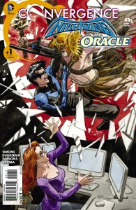
Written by Gail Simone
Pencils by Jan Duursema
Inks by Dan Parsons
Colours by Wes Dzioba
Letters by Carlos M. Mangual
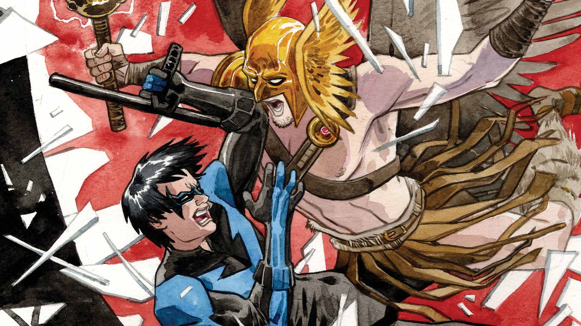
Pre New 52 Gotham City is back thanks to Convergence and it’s Nightwing and Oracle versus Flashpoint Hawkman and Hawkwoman (I won’t DARE call her Hawkgirl). If you’ve been tuning in to some of the other Convergence titles or you’ve read the solicits, you’ll know that this Gotham City has been trapped under the dome for a year now. Dick Grayson and Barbara have teamed up to fight crime and keep everything together but even that’s hard to do when you’re trapped like animals in a cage. If you’re a long-time DC Comics fan like I am, these Convergence tie-ins are a godsend of nostalgia. And with Gail Simone at the helm for this book, we at least know Nightwing and Oracle are in good hands.
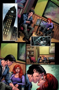 The writing is by far the strongest component of the book. It’s like riding a bike for the first time after a couple of years and Simone adds just the right amount of weighted history and nostalgia to make it all the more affective. What I loved about this issue was that it really explored the consequences of being under the dome. I really missed Oracle’s jaded perspective. She’s a pragmatist and she always has a plan. This makes her narrative all the more interesting in the current situation, especially when contrasted with Dick’s optimism. A year into being trapped in a bottle, many of Gotham’s citizens are not doing well. Everyone from villains to heroes is feeling the weight of, as Barbara puts it, seeing the track of the endless treadmill.
While we know the Dome is going to fall, getting an insight to this helplessness really lends to making readers feel an emotional hook to the event. With event fatigue, it’s easy to roll your eyes at another “universe changing” crossover event but the emotional weight coupled with added nostalgia makes this a worthwhile read. The big battle between the two sets of champions doesn’t go the way you think it will and it’ll be interesting to see how it plays out in the next issue.
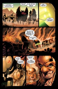 The art is also a call back to the old stuff, which is a double-edged sword. While it added to the nostalgic feel, this throwback feels much more like a step back when we look at how far we’ve come in panel layouts and innovation. The art very much reminds me of the typical house style you’d see pre New 52, making it kind of underwhelming. I have to give credit to Jan Duursema though, who really manages to capture the expressions of desperation and fatigue on some of the characters’ faces.
Verdict: Check it out. I’m biased. Really, really biased. I LOVED the old DC Universe and any glimpse back will already have my stamp of approval. If you’re like me, you’ll probably really enjoy the throwback. While the art doesn’t evoke today’s innovative styles in comics, it does add to the nostalgia. For the “new generation” of comic book readers however, it will probably not have the same emotional attachment.
