Captain Marvel #3
Writer – Kelly Sue DeConnick
Art – David Lopez
Color Art – Lee Loughridge
Letterer – Joe Caramagna
Review by joey Braccino
HIGHER, FURTHER, FASTER, MORE – Part Three!!!
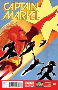
Captain Marvel recovers her ship (and her cat) in true bad@$$ fashion while the Guardians of the Galaxy look pretty in the background! The intergalactic-political realities of Tic’s homeworld are revealed! Carol and Peter Quill make the snappy quips and jokey jokes! Raccoons!
Kelly Sue DeConnick’s Captain Marvel has always been, first and foremost, an exploration of Carol Danvers’ identity. Sure, there are plenty of supercool explosions and flying/action sequences, but DeConnick is always sure to ground the series in Carol’s humanity, whether she’s fighting giant robots or zipping around the stars. With Captain Marvel #3, we’re still very much in this mode; yes, there are some fist-pumping action scenes early on, but DeConnick is quick to bring this issue back around to Carol’s new role as, essentially, Space Avenger.
The latter half of the book sees Carol interact with Tic’s refugee society. DeConnick expertly portrays Carol’s discomfort with the new job of diplomat; the good Captain is more than exciting when fisticuffs trump pleasantries upon first meeting Tic’s people. The highlights here come when Carol learns something about this new culture because, in doing so, she must learn something about herself. While it seems to have taken a back-seat in the new volume, the whole “amnesia/rebuilding-my-personality” angle of Carol’s character does leave a certain self-improvement motif running through the book. Another solid outing here that helps contextualize Carol and Carol’s journey to the stars.
David Lopez’ artwork has shifted significantly in just the last three issues. Back in issue #1, I remarked that Lopez’ naturalism mimicked the sort of “House Style” over at Marvel. Here, in issue #3, Lopez’ otherwise realistic aesthetic has taken on just a hint of pulp, blending in a bit of Chris Samnee-esque linework. Lee Loughridge also seems to be experimenting, shifting over to stark reds and blues in the abundant space sequences. One of the things I loved about the previous volume of Captain Marvel was the innovative artwork, so it’s nice to see Lopez and Loughridge stretching out a bit as the series rolls on.
Verdict
Buy. Captain Marvel is consistently one of the most enjoyable books on the stands. Now that we’re a few issues in, it seems as though DeConnick, Lopez, and Loughridge are starting to take more risks and push the book to those “new heights” that the tagline would suggest!


