By Bobby Shortle
Like the rest of the vocal internet, my initial reaction to DC Comics new logo was bordering on revulsion. It seemed dry, colorless, and without personality. A symbol more suited to a publisher of text books than one of comic books. The current DC logo, while not perfect, at least put forth a sense of something exciting behind its patented star adorned blue swirl. Sure it was a little gaudy and a little old fashioned but something about it said, “this is about super heroes!”
It’s now been a week or so since that first image leaked and in the interim the brass over at DC has begun to roll out what the true vision for this redesign really is. We now know that bland first image was nothing but a blank slate and is, in point of fact, just a the template for a more personalized branding mission by the company. To be honest I feel a little silly at the moment because I now think the new look is exactly what the company needed. DC has been trying to catch Marvel in the “cool” department for many years and they have, Dark Knight aside, failed miserably. In the past few months, though, I believe things have begun to change. They have ushered in the DC New 52, gone day and date digital and now have instituted a dramatic aesthetic change to their public face. So why do I think this new logo is the right move for the company? Well….
Clean = Sexy
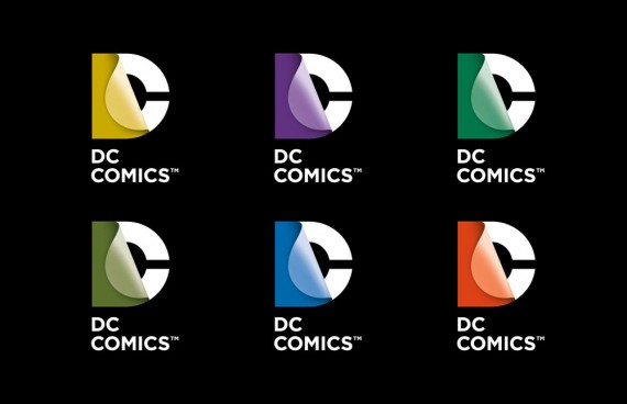
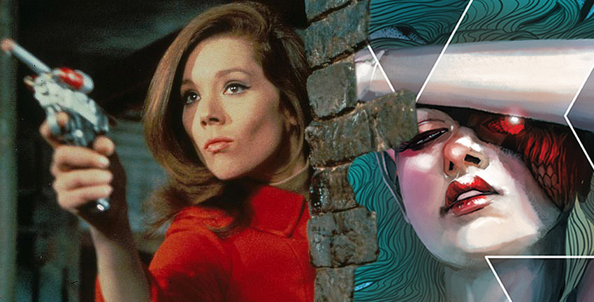
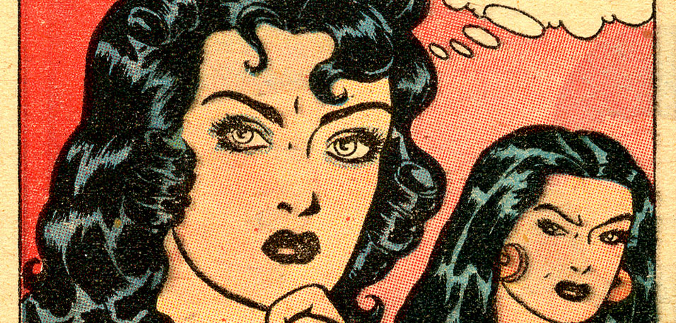
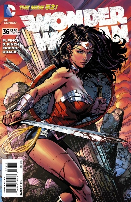
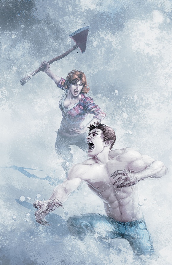
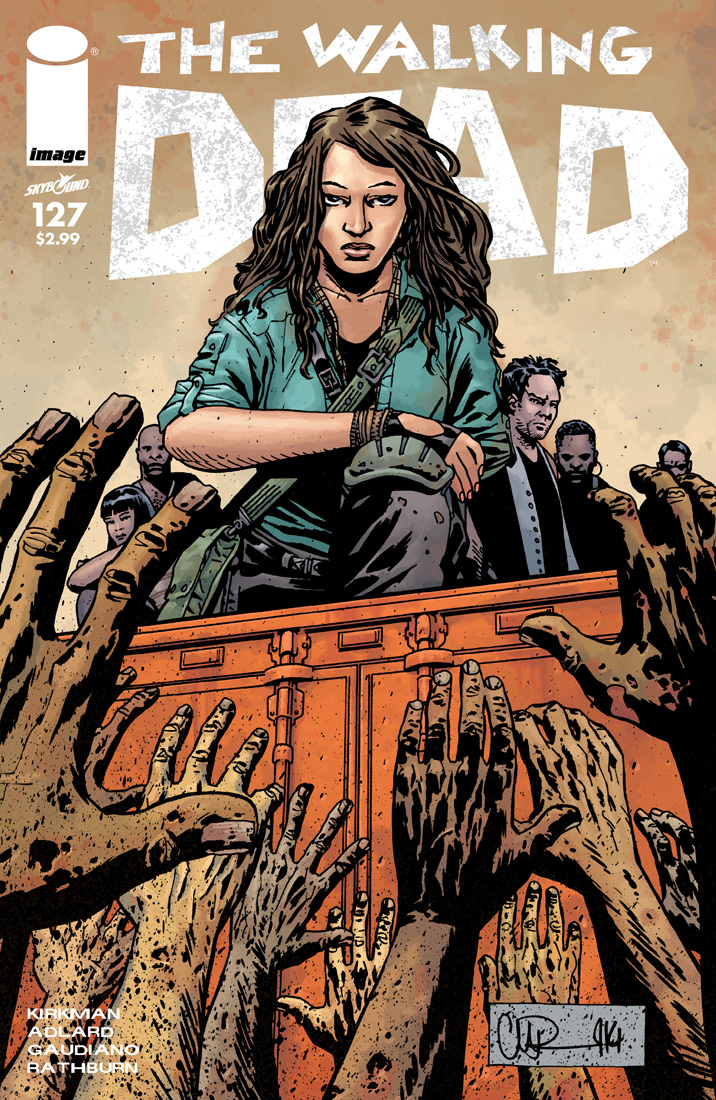
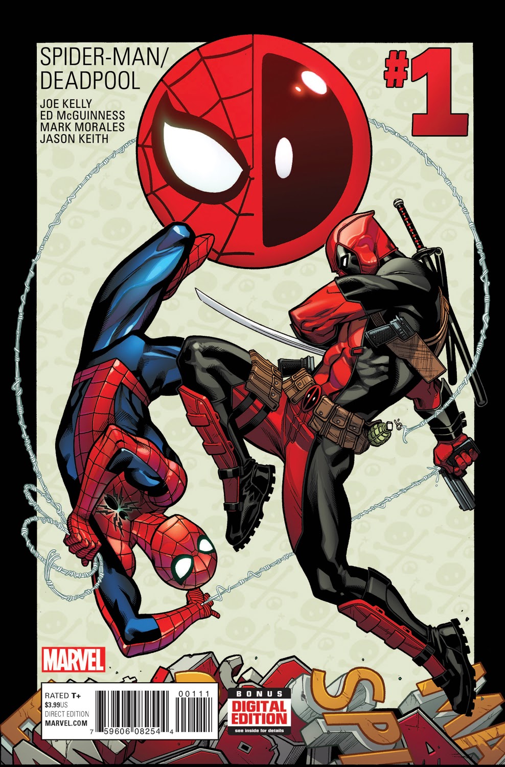
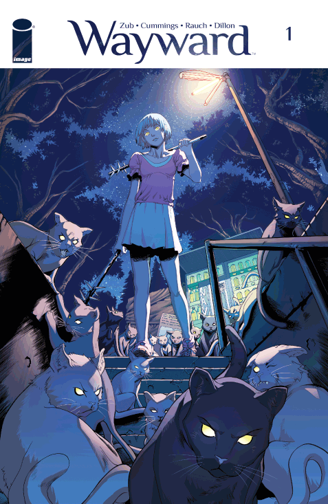
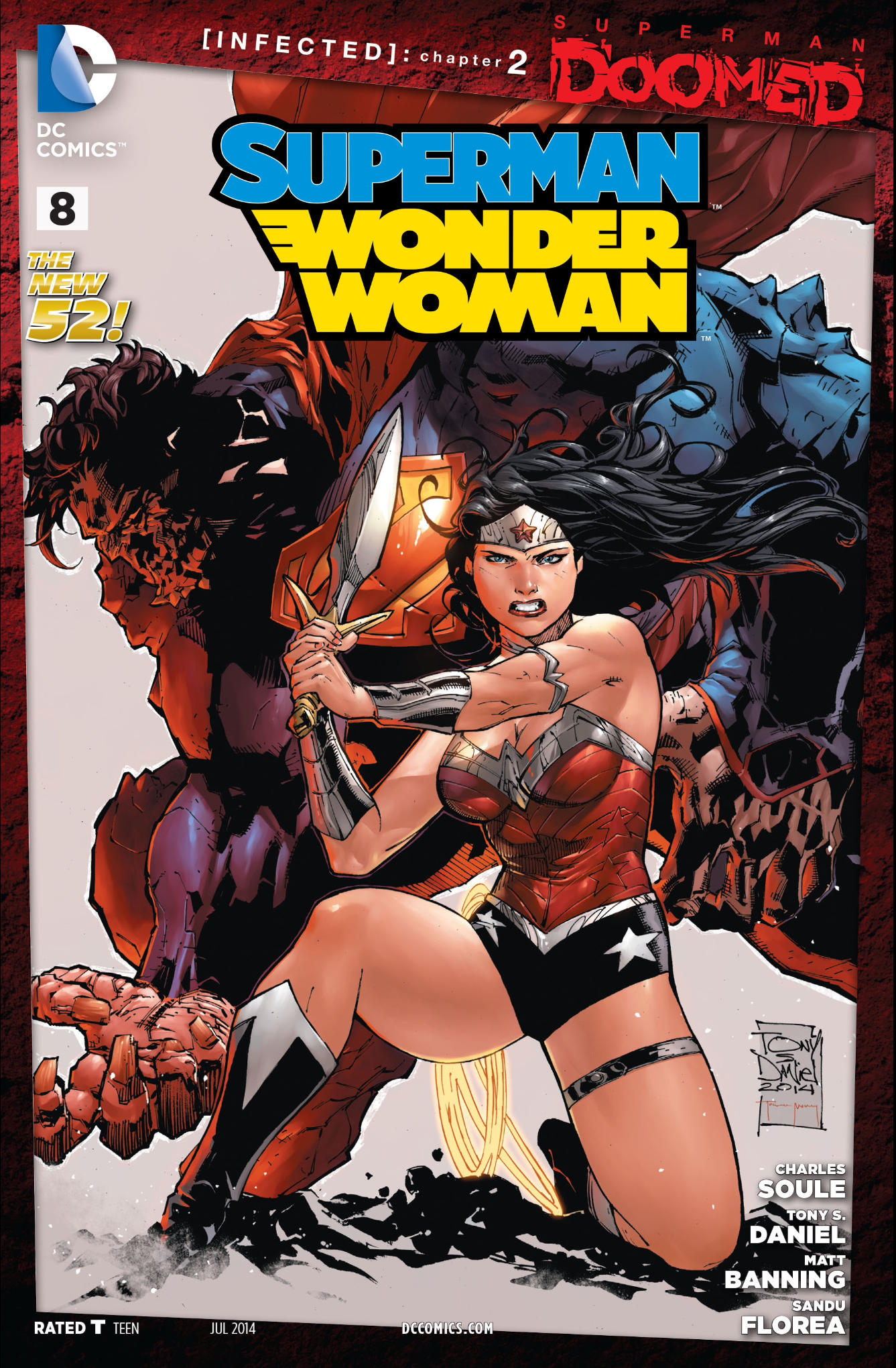
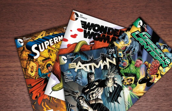
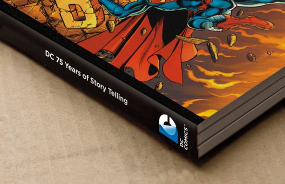
The current logo features a very specific color pallet that has come to represent DC Comics. It is, as I said earlier, a very showy piece of design that reflects one aspect of the company. But what about those smaller books for which a star and a swoop don’t fit? What about the fact that DC is no longer just a creator of comic books but instead a multi-faceted entity that produces TV and big budget movies? Their current logo does not convey these principles and in fact, it actually discourages them. Look at Apple, Adobe or Microsoft and you will see that at one point in their histories they made the transition from complicated branding to simple branding and it’s always worked out for the positive. Some people have unfairly compared this to GAP’s horrible redesign from a few years ago but that’s simply wrongheaded. This is a move to a more modern look that is visually recognizable yet clean enough to not take away from the products it adorns. I mean do you really want to be focusing on the logo on a great comic book cover? Check out some examples below of its many uses.

A Company of Many Faces
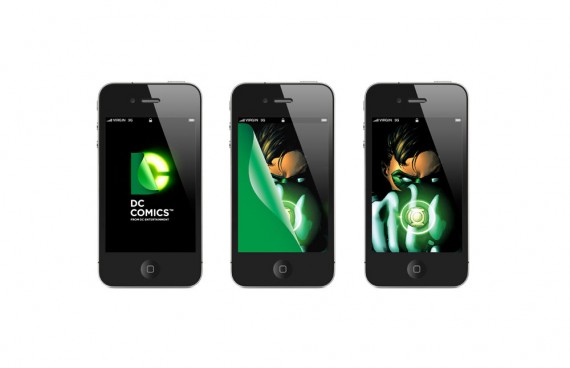
I don’t know about you but I think the above images are pretty bad ass. They don’t over power but they have a starkness to their color pallet that I really dig. Most of all though, they are all focused on the character or book they represent. Which is why I’m also fine with new DC Entertainment brand. The company can’t survive on book sales alone so if we want to keep getting our monthlies we need to face the fact that they need to appeal to a broader audience. Even more important is to have the new larger audience to realize that the exciting movie they just watched, great game they just played or awesome iPhone app they just downloaded were all made by the same people who put out comic books.
Time to Grow Up…Kind Of
As a geek I want people to experience the same joys that I do. I want them to realize that although we put on a grown-up face, it’s still damn fun to always be a kid inside. This is only possible if the public perceives those things we love not as a walled garden, but as a place where all are welcome. We have to be mature enough to know that there is a difference between the creative side and the business side of the companies that produce our passions. No more whining that things we love are changing with the times, because, as fanboys, if we want the things we love to be taken seriously, we have to be willing to look like we are doing the same. That’s what I think this new branding communicates.
Call me crazy for getting that out of a new logo designed by a multi-billion dollar corporation, but hell if you can’t believe in comic books, what can you believe in? Plus you can’t tell me that the images below don’t get your nerd heart racing just a little. They certainly did mine.
