MIGHTY MORPHIN’ POWER RANGERS #1
Written by: Kyle Higgins
Illustrated by: Hendry Prasetya
Colors by: Matt Herms
Letters by: Ed Dukeshire
Review by John Dubrawa
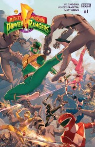
It’s time once again for a trip through 90s nostalgia because BOOM! Studios’ Mighty Morphin’ Power Rangers #1 is here! It’s been almost two months since the inaugural #0 issue, and while that was by no means a necessary read in order to jump straight into this issue, MMPR #1 does build off of and improve on many aspects of what was already a promising start to this modernized take on the seminal TV show. There is no denying that the Mighty Morphin’ Power Rangers are undergoing a resurgence and this new comic series is leading that charge by providing a reason to love the Power Rangers all over again.
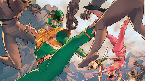
Characterization is the focal point of writer Kyle Higgins’ narrative in this issue, with a strong emphasis being put on the Green Ranger’s questionable loyalty within the group. Tommy Oliver was always the most fascinating element to the show so to see Higgins begin his run on this title with this Manchurian Candidate-esque storyline is sublime. Higgins sneaks a little hint of a relationship forming between Tommy and Kim (the Pink Ranger, but you already knew that!), and even shows that Tommy may not be the only member of the team having trouble focusing as of late. While not the bombastic action-packed opening chapter perhaps some might be hoping for with a Power Rangers story, there’s a lot of promise for this series to be rich in character development, which is definitely not a bad thing.
One of the complaints I leveled at the #0 issue was in Hendry Prasetya’s art when it came to depicting the Rangers outside of their uniforms in a rather nondescript way. Unfortunately with the narrative calling for the characters to be out of their trademark costumes for a majority of the issue, that problem persists here as well. While I certainly enjoy the lighthearted, almost manga-like character designs that Prasetya employs, there’s still a lack of personality behind the eyes so to speak. Perhaps when the other Rangers start having larger roles in the series (Billy and Trini are virtually benched this issue), Prasetya will have a better opportunity to give these characters a more defined look and feel without their suits. That being said, the limited time we do get of some of the Rangers in costume remains remarkable, with Matt Herms’ colors lending a perfect finishing touch to an already stunning layout.
VERDICT
BUY THIS BOOK!, or if you bought the previous #0 issue, CONTINUE TO BUY THIS BOOK! Either way, this series continues to be a Power Rangers fan’s dream come to life, with an excellent opening chapter set in the universe of one of the 90s best TV shows. This issue also provides enough backstory in its opening pages to fill in the blanks for any newcomers, though don’t expect an entire crash-course on the show’s history. For that, you’ll have to check out the series in its entirety (yes, watch the whole thing!). For now, though, check out this issue.
