Howard the Duck #1
Writer: Chip Zdarsky
Artist: Joe Quinones
Color: Rico Renzi
review by Gary Chapin
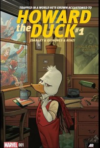 There haven’t been many Howard the Duck number ones through the years, so this is a big deal. The first one, Steve Gerber’s, the one that broke the … whatever there was to break in 1975 … was a hyperliterate, self-referential, densely packed adventure-comedy with a dark streak. The first issue has Howard contemplating suicide on the slimey banks of the Cuyahoga River, out of which juts a mystical tower constructed of old credit cards. It also had the word “brobdingnagian” which … y’know … hurray! This was all before page 5.
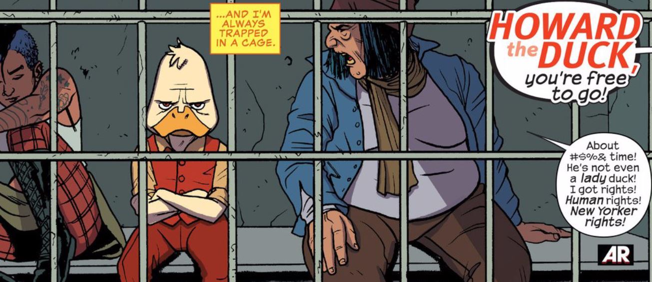
Zdarsky, Quinones, and Renzi give us a different duck. After a plot-relevant prologue page, we meet Howard in jail, being released. The cops know him. He’s a pain in the ass. He’s got his cranky place in the community, and the beginnings of a friendship with a tattooed girl sidekick. Gerber’s Howard had the tagline, “Trapped in a World He Never Made,” with all the raw, suicidal outrage that implied. Zdarsky’s Duck has the tagline, “Trapped in a World He’s Grown Accustomed To.” And that shift in the vision of the series infuses the character, plot, and humor with an edge that had me doing more than one spit take onto my tablet. (The Spider-Man thing … amiright?)
Not only has Howard grown accustomed to us, but we’ve grown accustomed to him. Zdarsky, to paraphrase a number of Talking Comics reviewers, is not only giving us the Howard we deserve, he’s giving us the Howard we need.
The actual plot is worth a mention. Howard (who works as a private detective) is hired to get back some swag that was stolen by Catwoman … I mean, Black Cat! In the course of the investigation he runs across She-Hulk, Spider-man, the tattooed girl sidekick, the Black Cat, and a villainous alien, the Gatherer. (Not the Collector, the Gatherer!) No spoiler’s here, but I saw the last panel reveal coming a mile away … and didn’t mind a bit.
Zdarsky’s writing is, in itself, a good time to read. Quinones and Renzi’s art and colors are great for the book. Am I the only one, though, who is marveling at the Allred-ization of their pull list? No, the art wasn’t done by the Allreds, of course — but, dang it, when I look at She Hulk, Spider Woman, Silver Surfer, and now Howard, I see a trend. And I like it. I don’t know if the Allreds started the bright colors, clean lines, and uncluttered panels thing, but I associate it mostly with them and welcome it. Tell me in the comments if it’s just me.
I am also very very charmed by the redesign of Howard from his early “Why does Donald Duck have a cigar?” days. This look has been evolving for a time. It looks back to George Lucas’ otherwise excremental film, and gets this right. Let’s hope it becomes the new normal for Howard.
And he doesn’t smoke. There is no cigar. No one in Marvel smokes. I’m good with that, too.
Verdict: Buy it. Yes! I am weary of our fetisization of First Issues, and I’m wary of judging a team’s effort on only the first issue. But this is a good start for what I’m thinking could be a great book. The book didn’t destroy me, but left me very hopeful for it’s future. The act of a adapting a character like Howard for a time forty years after his creation (“a time he never made”) seems enormously tricky to me, and this team is getting it right. I’m on the train. Waugh!
