Tooth and Claw #1
Writer: Kurt Busiek
Artist: Benjamin Dewey
Color Art: Jordie Bellaire
Lettering and Design: John Roshell & Jimmy Betancourt of Comicraft
Review by Nick Guerrera
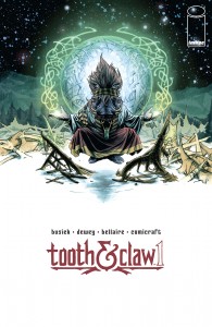 Announced at the Image Expo in July, Kurt Busiek’s (Astro City, Marvels) new ongoing series from Image Comics, Tooth and Claw, is “Conan meets Game of Thrones meets Kamandi”. Tooth and Claw is an anthropomorphic fantasy epic, featuring art by Benjamin Dewey (I Was the Cat) and colors by Jordie Bellaire (Pretty Deadly, Nowhere Men, et al.).
I’m not the biggest fan of the fantasy genre. I don’t hate it, but I don’t seek it out either. I prefer sci-fi, horror, and super-hero to fantasy. That said, I love anything with a good story and great characters. In Tooth and Claw #1, Kurt Busiek delivers both, with skill and finesse.
Tooth and Claw #1 tells the story of a kingdom of walking and talking magical animals whose magic is fading, and their attempt to re-infuse their world with magic. At the center of the story, is a young dog (Bull Terrier) named Dunstan. Dunstan’s life is turned upside down in this issue, kicking off what appears to be a classic coming-of-age story. There’s a mystery character playing the role of the “chosen one”, who is supposedly going to save the world…I have a feeling Busiek will turn that trope on its head, though. In 48-pages, Busiek does a lot of world building and some very good character development, especially with Gharta, a female warthog wizard, and Dunstan (the adolescent Bull Terrier).
 Ben Dewey’s art in Tooth and Claw #1 is beautiful and expressive. Each character in each panel is detailed and dynamic. They always seem to be doing some action. Even when they’re just talking, they’re using body language — and each character has their own body language, which helps define and develop the characters in our (the readers’) minds. Ben also uses a visual trick to help the main characters in each panel pop. I don’t really know how to describe it, but he mutes, or fades, the background elements that aren’t necessarily important at the time. Not only does this technique help keep what’s important in the forefront, it also creates a sense of depth.
The Verdict
Buy it! I love how Image Comics will put out a new number one, with 48 pages of story, no ads, and in full color, all for only $2.99! What’s there to lose (besides a few bucks and a bit of time)? If you’re a fan of the fantasy genre, or even if you’re not, give Tooth and Claw #1 a shot. Busiek’s storytelling will leave wanting to know what happens next. The characters he introduces are interesting, and while they follow the conventions of the fantasy genre, they aren’t stock or generic. The art, colors, and lettering fit well together, helping Busiek build his world and characters.
