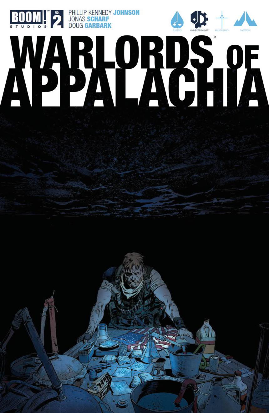
Warlords of Appalachia #2 Review by Max Mallet
Written by: Phillip Kennedy Johnson
Illustrated by: Jonas Scharf
Colored by: Doug Garbark
Lettered by: Jim Campbell
Publisher: Boom! Studios
“If the woods go quiet, run ’til you hear birdsong.”
2016 has birthed several noteworthy comics series about post-apocalyptic, dystopian worlds and futures. Warlords 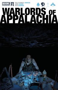 of Appalachia has a familiar, yet focused scope: Kentucky has previously seceded from the United States, and Uncle Sam hit back. HARD. Kentuckians live under a government jackboot and are treated more like enemy combatants than American citizens. Kade Mercer, a native son of the Bluegrass State, becomes the avatar of hope and open rebellion after violence erupts between locals and the United States military.
Phillip Kennedy Johnson (Last Sons of America, Killing Marcus) is uniquely situated to write this story. A Sergeant First Class in the United States Army who studied in Kentucky, Johnson has a firsthand knowledge about the people and land that bring Warlords of Appalachia to life. He doesn’t treat them like dumb hicks, nor like the virtuous salt-of-the-Earth. This gives focal characters believable motives and true agency. In this second issue, Johnson implements a great formatting tactic of a military PA system. This device grants a sense of pace, high stakes and a tenseness in the atmosphere while moving the story forward. The author conquers a lot of story in the first two issues, with the second addressing possible loose ends. Johnson’s story is linear and his language is terse and to the point, much like the characters that he commands.
The art in this issue is brimming with realism and a sparse color pallet, which speaks to the bleak and war-torn nature of the story. Comics newcomer Jonas Scharf makes the people and places in Warlords of Appalachia feel extremely grounded. In each of the first two issues, Scharf uses the hulking protagonist’s quickness to anger to great effect. Colorist Doug Garbark (DC Bombshells, Star Trek) absolutely shines in a couple of sequences, specifically where shadow and glowing eyes signify characters’ places in the story, as well as an ominous atmosphere. To this point, the art team has left its mark with action and scenery, as emotion and characters development have been left largely on the back-burner for the time being.
Verdict: Buy. Johnson’s Twitter bio includes, “Enemy of fascists, and of fascism.” This rings true throughout the book, as Kade Mercer is growing into a reluctant Mockingjay in a brutal landscape. The art compliments the story’s mood and scope, with tremendous use of shadows and wooded landscape. Warlords of Appalachia #2 is an answer to some of the turbulence and concerns of our time. If dystopia is your jam, then give it a shot!

