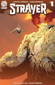
Strayer #1
Written by: Justin Jordan
Art by: Juan Gedeon
Colours: Tamra Bonvillain
Letters: Rachel Deering
Review by Matt Peterson
AfterShock Comics has made quite the entrance into the comic book industry after just only a couple of months on the comic shop (and recently digital) racks. To label the creative teams working on the new AfterShock titles as “impressive” would be selling them short. Strayer is the next comic to join a very impressive initial lineup of comics on the Aftershock line.
Set in a dystopian, post-apocalyptic future, Strayer introduces readers to a world where not only resources like metal are scarce and hold great value but so is magic. Apparently bandits, raiders, Kashas, and even Titans are not so scarce. That seems to be a problem for everyone except for Strayer, who will gladly dispose of those pesky behemoths threatening to pancake the small villages of the Edgelands… if the price is right.
Justin Jordan has developed what appears to be the basis for a very intriguing post-apocalyptic fantasy world for our characters, Mala and Strayer, to adventure through. Unfortunately, the first 32 pages of Strayer did not present enough unique development to grab my attention right off the bat. Jordan may have presented some very interesting undertones in this debut issue of Strayer that, given time, could develop into a very well developed and captivating fantasy world, but the end result is a pretty standard fantasy tale. However, I think this series has a lot of promise and because of the interesting concepts presented, as well as the hook at the end of the comic, I’ll be coming back for at least one more issue. I will say that I found the mysterious, magic wielding Mala is much more intriguing than the title character, Strayer.
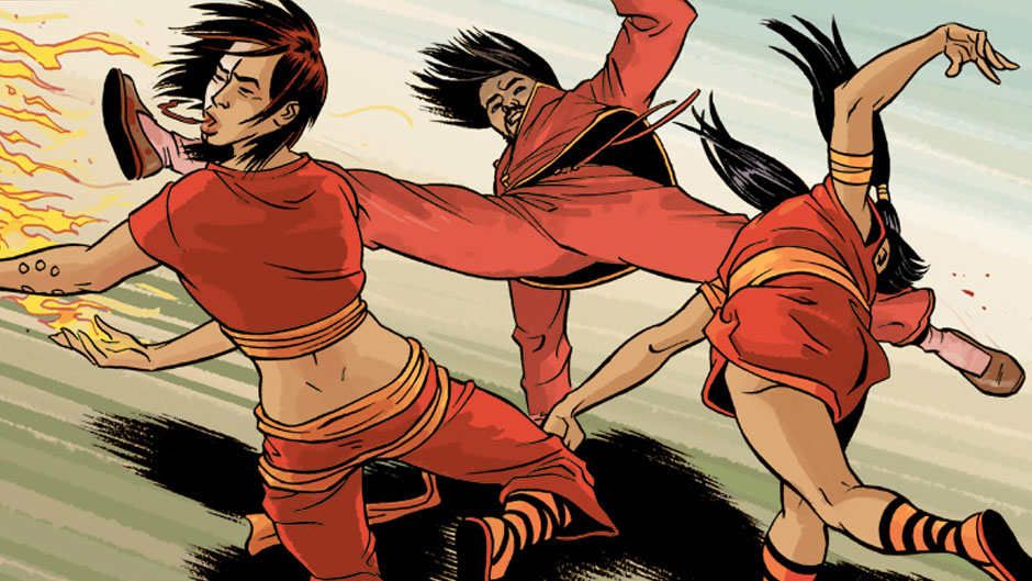
Juan Gedeon’s art was at times very appealing and beautifully drawn and was only enhanced by Tamra Bonvillain’s excellent use of color which popped throughout the entire issue. However, where one page would be sharp, focused, and overall just fantastic, the next page of Gedeon’s art seemed unfocused and rugged. Perhaps that is Gedeon’s art style, but this is the first comic of his that I can recall reading. Personally, I found it distracting that on one page I would be ogling over the beautiful and crisp art and on the next page I would find Gedeon’s lines jagged and rough. As a whole, I appreciated the visual aspects of this book; I just found myself not being a huge fan of the sharp contrast between panels.
The Verdict
Wait and See – The visuals for the most part were appealing and impressive, notably Bonvillain’s wonderful colors, and the story itself showed a lot of potential. I do think that this comic needs just a few more issues to really flush itself out, both in terms of story and art. For now, the initial story was little more than a generic fantasy bounty hunter tale. Given time though, I think Justin Jordan has introduced some elements that will develop into a unique and captivating fantasy world and story.
