Written by Robbie Thompson
Art by Stacey Lee
Colours by Ian Herring
Letters by VC’s Travis Lanham
Edited by Ellie Pyle and Nick Lowe
It’s Silk vs. the Raptor, Rage –The Pokemon Dude ROUND 2 (…or is it round 3 at this point?) in this newest issue of New York’s newest web-slinging wonder but is she on the ropes after her opponent’s Black Cat upgrade? After just two issues, this series has made it to the top of my pull list and once you open up this latest issue, it’s easy to see why. Robbie Thompson and Stacey Lee are a spectacular team, managing to balance the light-hearted banter that’s a signature trait in almost every Spider-Man franchise with the heavy weight of Cindy’s past.
The first two issues did well to establish Cindy’s world and state of mind and issue three goes a step further by building on the foundation laid out earlier. In the first issue Silk faced Pokemon Dude but now she has to deal with the 2.0 version and the fight scene transitions very nicely with another flashbacks. I really like how these flashback scenes remain unique in each issue. The first one focuses on her relationship with her family. The second issue focused on her relationship with an old flame. This one however delves more into her time in the bunker. Despite the generally light tone, it’s great to see some of the emotional cracks beneath the surface.
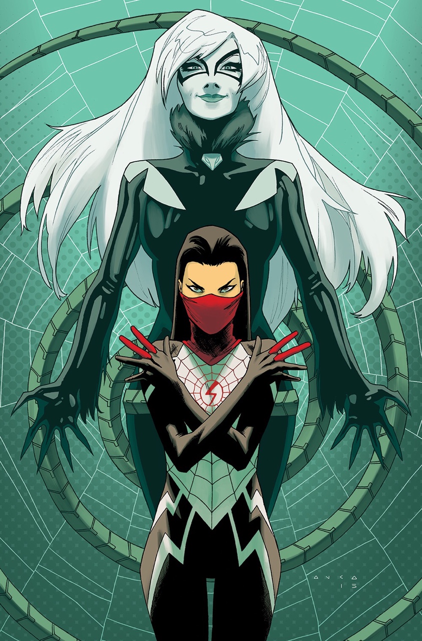
Black Cat also makes her appearance for the second time and their faceoff is really entertaining. It also gives us a good indication of what level Silk is at as a new superhero. This issue presents the only interpretation of Black Cat that I’m enjoying at the moment so kudos to Thompson for making that happen.
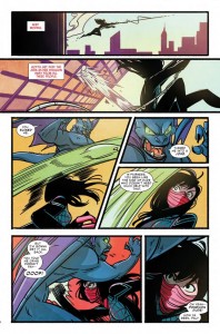 Stacey Lee’s interiors for this series are fantastic from the character designs to the page layouts. Seeing the flashback panels in direct contrast to the present scenes help make the Ian Herring’s colours pop and these transitions are seamless thanks to Lee’s panel layouts. The panels themselves aren’t just the traditional square or rectangle panels, instead they are more manga-like in design making for more dynamic fight scenes. Lee’s Black Cat design is also noteworthy as it makes far more sense than Ramos’ design in recent Amazing Spider-Man issues.
Verdict: Buy. Writer Robbie Thompson and artist Stacey Lee have gotten so much right with the first two issues that it’s really no surprise that this one proves they’re just getting better and better. Issues one and two could read as two very well done standalones but here we see more of a continuing storyline. I’m really excited to see where this series goes from here.
