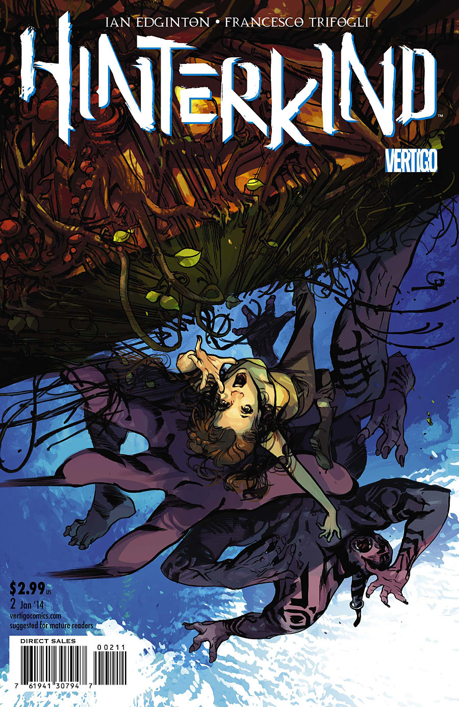
Hinterkind #2
Written by Ian Edginton
Art by Francesco Trifogli
Colors by Cris Peter
Review by Mike Duke
How long should a reader be willing to wait for something special to happen? A title like Hinterkind reminds me that, while the medium of comics is a wonderful way to tell fantastic and beautiful stories, the way in which we consume them sometimes betrays those stories. After two issues of Hinterkind, I still feel like I’m way behind, both with the story and the world. I personally believe that this book would greatly benefit from a longer format, like double sized issues or a graphic novel. 
Hinterkind #2 begins exactly where issue #1 ends, which only reinforces my feelings that they should have been released at the same time. Prosper and Angus are on a bridge out of New York City when they encounter a giant troll, just one of the Hinterkind that has taken over the former world of men. Once Prosper and Angus vanquish the lumbering beast they are engaged by a young human by the name of John Hobb. A quick Google search reveals that a Hob is a kind of household spirit from England, like a brownie or house elf. While he doesn’t look like a Harry Potter character, John Hobb is definitely more than he seems. About halfway into the book we get an interlude in California where we get to see a an exchange between the queen of the Sidhe and her daughter, who do not agree on how the remaining humans in the world should be treated. Again, a quick Google tells me that the Sidhe are a race of fairies\elves from the Irish and Scottish mythology. The exchange also provides us with some interesting information on how the rest of the country has been divided up among the various races of the Hinterkind. Then, it’s back to see how Prosper and Angus are fairing with their new companion, and they meet some new friends as well.
Hinterkind feels young, which means fresh and new as well as inexperienced. And, like I said earlier, its slow build isn’t doing the story any favors. This is not to say, however, that the story isn’t good. The characters are unique and fun, the world building is top notch and the plot is fascinating. Obviously, Edginton is pulling from old mythologies to build his characters, and I like the old world feel it gives the world. But, like I said, I think the book could have greatly benefited from a double or triple sized issues, at least here at the beginning.
The art is decent, just like in issue #1, but something about the colors doesn’t sit right with me. In certain panels, some of the colors look like they were applied with a marker or colored pencil–areas filled in with gaps between the strokes. I noticed it in the first issue, but I thought it might have just been a printing glitch. I’m not sure if it’s supposed to evoke a certain look or effect, but whatever it is, I’m not getting it. The effect just makes the book look sloppy in spots.
Verdict
Buy it. Don’t get me wrong, the book is good. The story is unique and definitely worth reading. But I have a hard time recommending it in single issues. Amazon has a listing for the first graphic novel to come out in early April of next year, and I personally feel like this would be the best way to experience this fascinating and unique tale.
