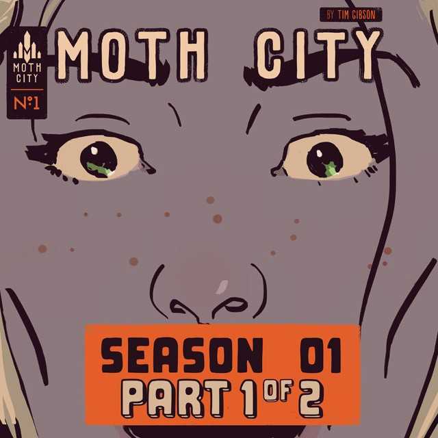
Moth City #1
Written and illustrated by Tim Gibson
Web design by Steven Holt (STEVE HOLT! (Sorry Steven…))
Web build by Mark Webster
Published by: ComiXology Submit
Review by Stephanie Cooke
I know it’s a bit unusual to see us credit web people for comic reviews, but after reading Moth City, I felt like it was a must since so much of what worked in this comic was thanks to a really interesting and revolutionary presentation.
When Mark Waid’s Thrillbent started coming out online, I was absolutely thrilled with how it was shown. You see, by controlling how the reader reads their comics and in what way, way they consume them Thrillbent makes their content into a kind of motion comic. I’m not sure if it or Moth City came first, but Gibson’s Moth City utilizes that same layout to show us what he wants to show us and when he wants to. And it’s freaking awesome. Mark Waid sums up Moth City’s aesthetics by saying it’s “the embodiment of what I’ve been dreaming digital comics can become.”
It’s so true. This format, which I’ll explain more in a moment, is a great way to get a non-comic book reader into comics. A lot of trying comics for the first time is figuring out how to deal with the panels and word bubbles and such. Even as a long-timer reader, I occasionally have a hard time working out what I’m supposed to be reading first and what I’m then supposed to move into. Of course, a lot of that is a matter of what makes sense after what you’ve read but it isn’t always that easy.
Moth City has integrated a layout into their ComiXology digital comic that allows a seemless transition from one panel to the next. Sometimes a panel will just have characters with no words but the next time you touch the screen, one person’a dialogue will appear. And the following touch leads to the next bit in the conversation and so on and so forth.
Like Waid said, this is the future of our industry… And I LOVE it.
I’ve rambled a TON about the presentation, but the comic itself is pretty fantastic as well. Gibson writes and illustrates the story himself and it’s expertly laid out. The story revolves around a weapons dealer who is about to sell a revolutionary product that’ll change the world. The art is appealing and the story seems well fleshed out.
I think a lot of my praise is because of how this whole thing was laid out, but why shouldn’t that be a reason to love this comic? Sure the story could’ve been crappy and I still would’ve gone through the whole thing to experience it. However, Moth City, despite having a fairly dark plot, is a great read, even though only the groundwork for the rest of the series has been laid out this far.
VERDICT:
Buy it. This is worth reading for the experience it provides alone. This really is the way that all other web comics should be looking to for ideas to create fresh and original content. I’m going to check out Issue #2, which is hopefully as satisfying as Issue #1.
