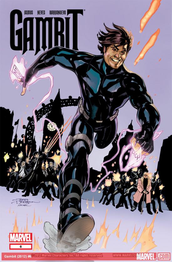
Gambit #6
Written by James Asmus
Pencils by Diogenes Neves & Al Barrionuevo
Inks by Allen Martinez & Raul Fernandez
Colors by Rachelle Rosenberg
Review by Joey Braccino
Gambit continues his (mis)adventure across the pond in merry old MI13-defended London! Borya Cich continues threatening to blow Gambit up if he refuses to work for him! Pete Wisdom continues acting far too ornery and aloof for such a strapping super-powered secret agent with a British accent! Excalibur, Supernatural weaponry, and alien power-sappers abound as Asmus and the art-team continue telling their Gambit tale.
Asmus’ script is filled with action, humor, and flair. The dialogue is fast-paced. Gambit’s narration finally is showing elements of his Cajun accent. The cliffhanger to this issue fits in perfectly with the larger narrative Asmus has been developing since issue #1. This should be a great comic book, and yet, for one key reason, it falls short of success.
The artwork has been all over the place since the second issue of this fledgling series. Clay Mann started strong as the series regular, and then eventually had to be joined by Leonard Kirk for additional pages. Fortunately, Kirk did a fairly decent job emulating Mann’s style, so the transitions between artists weren’t as jarring as they could have been. The same can’t be said for Diogenes Neves and Al Barrionuevo. Despite the changeover happening at a scene change, the two art styles are so different that it’s almost like reading two different comic books. Neves’ artwork is actually reminiscent of Mann and Kirk’s work on the series: ‘90s-inspired figurework, kinetic action sequences, widescreen panels. Barrionuevo’s, however, is more in line with a Paul Davidson or Alan Davis: naturalistic, thinned-out facial designs and interesting angles. The styles don’t work well together, and the changeover halfway through the book is jarring. Gambit himself is irregularly portrayed by each artist, making for a dissatisfying and distracted reading.
Verdict
If you can tolerate the inconsistent art, check it out. Asmus is doing his best to create a fresh take on the Gambit character. If only Marvel and the editorial staff could figure out these art issues.
