Go Go Power Rangers #2
 Written by Ryan Parrott
Art by Dan Mora
Colors by Raul Angulo
Letters by Ed Dukeshire
Review by John Dubrawa
If you’re like me and spent too many hours of your childhood devoted to all things Mighty Morphin Power Rangers, you’ve got to be loving how Boom! Studios is handling the franchise right now. Each month, the company is putting books on shelves that demonstrate a level of care for the property, which could easily have been treated as a means to wring 90s nostalgia for all it’s worth. Boom! is giving these books to creative teams that understand what the Rangers mean to its dedicated fanbase, and with each release it’s obvious they’re doing right by these characters.
Though it is still in its infancy, Go Go Power Rangers is the kind of series that gets these characters. In the series’ second issue, writer Ryan Parrott continues to focus less on the martial-arts-and-monsters aspect of the show, devoting more time to the teenagers underneath the costumes. His opening dialogue involving Kimberly and her on-again-off-again-possibly-on-again boyfriend Matt is full of the kind of teenage awkwardness that I could only laugh at now being in my 30s. Each character carries a unique voice that is the spitting image of what these characters should sound like.
Much like the first issue, however, the second issue does have difficulty with handling its dueling timeframes. Parrott freely switches between the time before these ordinary kids became the Rangers and the ensuing aftermath involving the villainous Rita Repulsa, and it can be jarring. Particularly, there’s a sequence at the end of the issue that involves a reaction to Kimberly that was, at first, a bit confounding. As a trade I imagine these pivots between past and present will be less cumbersome but as a month-to-month release, it’s taking some getting used to for sure.
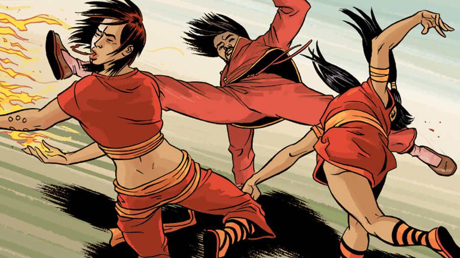
No matter what the format, though, Go Go Power Rangers is looking extremely good thanks to artist Dan Mora and colorist Raul Angulo. Mora’s art fits both with Boom! Studios’ whimsical “house style” and with what I imagine a more modern version of the Power Rangers would look like. Angulo’s colors assist big time in this regard; while each character maintains that somewhat-hokey show aspect of wearing their designated color all the time, it’s done here in such a way that it blends right in with the fashion. Together, this art team is doing right by the Power Rangers.
Verdict
Buy! As if it was evident already, Go Go Power Rangers continues to be another hit for Boom! Studios. They’re treating the Mighty Morphin’ Power Rangers franchise with the utmost respect, and writer Ryan Parrott is showing that he has a deep understanding for these characters that we all love so much. And if you want more to love about these characters, buy this book up.
