
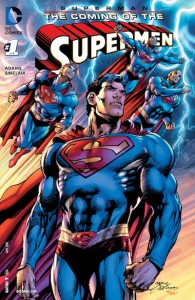
Superman: The Coming of the Supermen #1
Story/Artist: Neal Adams
Words: Neal Adams & Tony Bedard
Colorist: Alex Sinclair
Letterer: Saida Temofonte
Review by John Dubrawa
 Superman: The Coming of the Superman #1 is the beginning of a new six-issue miniseries where Neal Adams is free to do what Neal Adams does because, well, he’s Neal Adams… continuity be damned. There’s part of me that wants to shut down the review at this point because let’s face it, that opening sentence should be enough to either persuade or dissuade someone into purchasing this book. This is a return to a version of the Man of Steel that’s stark counterprogramming to the powerless everyman version of the character present in the current DC fiction. Readers that have been yearning for a Superman that doesn’t dress like he’s off for the long weekend will find that Adams has restored that classic Superman look and feel to this book. For better and for worse I would say.
Adams both writes and draws the book and he succeeds in one avenue more so than the other. Chiefly, this issue’s script (which was also co-written by Tony Bedard) is bogged down in quite a few places by the wordiness of the very comics Adams is attempting to throwback to, particularly when it comes to the writing of Lois Lane’s running commentary throughout the story. What begins at first as a necessary means to setup the plot—Parademons being led by Darkseid’s son, Kalibak are invading Metropolis—quickly becomes a redundant play-by-play of everything happening between the panels. This excessive dialogue comes at the cost of learning practically nothing about the titular Supermen or finding a real place for our own Superman, who spends a majority of this issue away from the action getting vague answers from a mysterious Djinn. Right now it’s just not clear how Superman and these new Supermen will fit together in the narrative moving forward.
As expected, the strength of this issue is found in Adams’ art, which fits the classic feel of the book perfectly. His characters are big and bold with muscles on top of muscles, but never in a completely ridiculous way (at least, not by comics standards). His Superman even regains his characteristic spit curl, too. Adams is also able to amplify the action of the issue with fight sequences that literally come off the panel, and the color work by Alex Sinclair gives those scenes that extra pop. The opening shot of Kalibak entering the fray is a stand-out art achievement in this issue, and with Adams promising more New Gods material to come, I can only imagine this book getting more outrageous in the art department moving forward.
VERDICT
Buy, tentatively. Listen, not to discount all of what I just wrote about Superman: The Coming of the Supermen #1 but this is a Neal Adams book and that alone should determine whether or not this book is for you. The story is not told in the best way, but the art shines in a way that celebrates the Superman of old. If you’re someone that wants a way to read a Superman story that feels right at home before he buzzed his hair and picked up a pair of Wranglers, this issue will bring that nostalgia full force.