
Burning Fields #1 Review
(BOOM! Studios, full-color, 32 pages (22 pages of story), released 01/21/2015, $3.99 US)
Written by: Michael Moreci & Tim Daniel
Illustrated by: Colin Lorimer
Colors by: Joana LaFuente
Letters by: Jim Campbell
Review by Nick Guerrera
The story of Burning Fields deals with Dana, an ex-army investigator, who returns to Kirkuk, Iraq to investigate (with the help of a local Iraqi police detective, Aban Fasad) the mysterious deaths and disappearances of American oil-drilling technicians. Tensions are high in Kirkuk, as local citizens and law enforcement struggle against armed U.S. private military contractors whose best interests lie with their employers, not the people of Kirkuk.
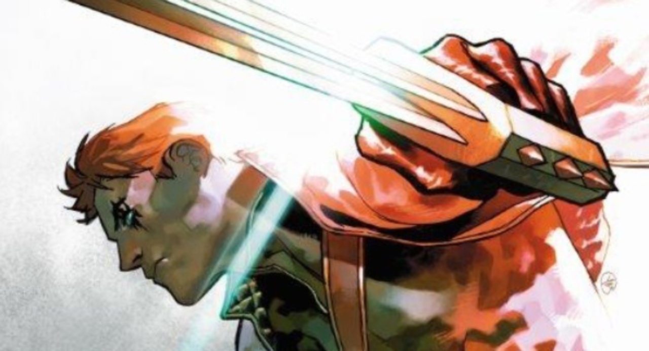
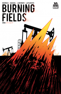 Two things drew me to Burning Fields #1: the simple yet striking cover (by series artist Colin Lorimer) and the beautiful panel layouts and colors of the first two pages. There is so much raw, dark, energy on pages one and two that I couldn’t help but be pulled in. What follows is a well crafted introduction to a “geopolitical drama with monster mythos.”
The writing in Burning Fields #1 reminds me of the modern U.S. TV drama writing style, which doesn’t surprise me since Tim Daniel’s Enormous series (from 215 Ink) read like a movie (I haven’t read anything else by Michael Moreci to compare with). To match the TV writing style, the art depicts environments and people realistically, with what appears (to me) to be heavy vector photo-tracing and photo-referencing. The inks are thick and black throughout. Lorimer’s characters are all accented with pure-black lines and shadows, whether in night scenes, or bright, outdoor daytime scenes.
Colorist Joana LaFuente does a superb job of balancing hues, tints, and tones throughout the book. Her coloring maintains the TV-like mood of the story without overdoing the obligatory teal/orange color grading of the current Hollywood visual style. Letterer Jim Campbell deals with the issue of translating foreign language inside of word balloons in a unique way that does not detract from the flow of reading. Overall, the craft of Burning Fields #1 is high on all fronts, even if the style might not appeal to all comic readers.
The Verdict
If you like your comics to read like a modern U.S. high-tension TV drama, check out Burning Fields #1 from BOOM! Studios. The first issue artfully presents the opening act of a layered story about people with very different beliefs working together against a supernatural threat that is bigger than them all. While this single issue didn’t do much for me, I imagine binge-reading the complete story in trade paperback form would be fun and intriguing!