Written by Robert Napton & Seamus Kevin Fahey
Art by Christian DiBari
Lettered by Troy Peteri
Review by Logan A. Rowland
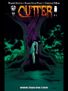
Cutter begins intense and terrifying. From the first pencil scratches on the page, we know who the “monster” is and the weapon of choice, both of which are pretty terrifying in their own right. The overall plot of Cutter is not exactly innovative and is very reminiscent to much of something that we have seen before. A dark past comes back to haunt those who previously survived it. It’s been done a million times and a million times over that. And while Cutter does not do anything exceedingly special, it does a decent job of presenting tone and overall horror.
There are some moments that excel, such as the protagonist’s relationship and interaction with his pregnant wife. You immediately understand their relationship. With a few short sentences and facial expressions, it is clear to the reader as to their intimacy and overall affection, whether that be exceedingly so or lacking thereof. When there is interaction with horror, it is presented very well and instills fear in the reader.
And where there are moments that excel, there are a few moments that fall flat. Early on, before there is even a threat, our protagonist is walking to his car. He hears a weird noise and it scares him in a way that doesn’t line up with what his train of thought should be at this point in the narrative. It’s creepy, but is not well placed.
The art is scratchy pencils and purposeful marks, along with its fair share of Benday dots. Often the look of the book is very striking, but there are some panels and even pages that look like they could have been doctored a little more with some characters looking oddly blurry. Some pages could use color as the blank spaces leave the page feeling empty. Unfortunately, the worst sin this book commits is the odd mix of traditional pencils and art and Photoshop. Photoshop is a wonderful tool that can lead to incredible results when the art and the program are mixed together evenly and purposefully. The speech bubbles, sound effects and even computer screens are clearly separated from the art itself, and it can take you out of the story. Adding textures on top of these images could have possibly saved it from this problem, but, regrettably, it isn’t as aesthetically pleasing as much of the art is.
Cutter is creepy and is setting up to be a fun October read as it will be released weekly this month. It’s grayscale is genuine in presentation, if not a little empty at times and the narrative is familiar but doesn’t quite feel like it’s banging on your head. The reasoning for the books title is unsettling, that is for certain.
Verdict:
Pass. Wait for the trade. Or, of course, you can read it every week in October if that is what you would like. The story isn’t quite enough to keep you locked in yet. It has potential, but if you are looking for something good to read for Halloween…well, I’d still probably look elsewhere. Image’s Outcast is shaping up to be stellar and you can read it well past October, and if you haven’t yet, check out Joe Hill’s Locke & Key for great horror and story.
