Deadly Class #1
Story: Rick Remender
Art: Wes Craig
Color: Lee Loughridge
Lettering & Design: Rus Wooton
Review by Joey Braccino
Deadly Class #1 is a tricky book to place stylistically. On the one hand, we’ve got a somber, existential meditation on the sorry state of poverty, ambivalence, and inequity in 2014 1980s, as seen through the angst-ridden eyes of homeless, forgotten, sick-of-it-all teenager Marcus Lopez. On the other hand, we’ve got a kick-ass, high-octane action romp set in San Francisco that culminates in an occult ring of ninja assassins and its academy for the titular academic fare.
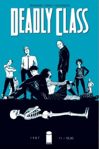
Rick Remender–current Marvel bigwig (Uncanny X-Force, Uncanny Avengers, Captain America) and general comicdom favorite—weaves these two disparate genre threads together in the enthralling Deadly Class #1. The first half of the book follows Marcus as he navigates the Absurdism of his lowest-of-the-low existence. Marcus wards off other vagrants eyeing his footwear, frequents homeless shelters and eats green gruel, and chronicles all of his political, religious, and philosophical musings in a journal. It’s a depressing way to start the book, especially when we consider just how current some of these issues feel despite the 1987 setting. Remender is well aware of the connections, and chooses to focus on Marcus’ character and backstory rather than littering his book with ‘80s references and connections (thankfully). When the book shifts over to its promised premise, we’re both taken aback by the jarring genre-shift as well as thankful that Marcus might finally find a purpose in his otherwise aimless life. Sure, that purpose entails enrolling in a secret underground assassin school and sure, it kinda feels like Wanted with a twist, but it’s still a purpose!
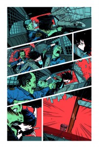
Wes Craig and Lee Loughridge put together one hell of a visual experience in this comic. Reminiscent of the pulpy, punk-rock, Gen X aesthetic of the Hernandez Brothers, Deadly Class looks like a comic straight out of the era in which it is set. Craig’s mix of realism and scratchy expressionism looks like something out of the aforementioned Hernandez Brothers’ Love & Rockets or one of Frank Miller’s iconic pulp comics. Loughridge’s stark colors—blood reds, flat violets, greying blues—add to that alternative feel. For a more contemporary comparison point, check out Emma Rios or Javier Pulido’s eccentric expressionism in books like Pretty Deadly or Hawkeye! Cementing that ‘80s feel, however, is Rus Wooton’s distinctive lettering design. Like something out of Watchmen or The Dark Knight Returns, Wooton hits that italicized slant hard in the narration. Straight up PUNK.
Verdict
Check it out! Strong characters, stellar artwork, and deep thoughts abound in Rick Remender’s Deadly Class #1. Did I mention the artwork is insanely awesome? Because it is. BUY!
