
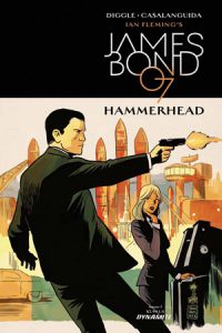
James Bond: Hammerhead #1
Writer: Andy Diggle
Artist: Luca Casalanguida
Colors: Chris Blythe
Letters: Simon Bowland
Publisher: Dynamite
Review by Max Mallet
“We only sell to our friends.”
There were James Bond novels and comic strips in the 1950s before the world saw Sean Connery’s portrayal of the spy in 1962’s Dr. No on the silver screen. More than 60 years since Ian Flemming’s first James Bond novel, the character still translates remarkably well to the written page. Presumably in an effort to hook fans of Daniel Craig’s most recent portrayal of 007, Andy Diggle (Hellblazer, Green Arrow: Year One) and Luca Casalanguida (Skorpio) come out with guns blazing from the first page of James Bond: Hammerhead #1 by Dynamite Comics. When Bond’s efforts to gather intelligence about a threat in Venezuela cause more collateral damage than MI6 cares for, he’s sent to Dubai to guard against possible threats to British interests.
Diggle’s take on Bond is lethal, playful and true to his on-screen adaptations. The first few pages combines daredevil stunt work a la Ethan Hunt with the cold decisiveness and inevitability of Batman. This allows for a formulaic albeit incredibly satisfying first act of the issue. The recipe of Bond killing intelligence assets, getting scolded and then immediately sent on another mission isn’t exactly innovative in this comic. It’s the small Bond moments that carry the story; the way he’s stern at all times, with little variance in his manner of speaking, until an attractive woman enters the scene. Diggle gives readers the pompous overconfidence that makes 007 both enviable and vexing. After an explosion, Bond points out, “Business is booming.” It’s the corny-yet-lovable Dad joke that the audience would expect the spy to say. Diggle has a good grasp on the little things that make Bond tic.
Casalanguida’s artwork is vivid throughout. The first action scene is pretty violent, even gory. The inking sets the mood of the story, giving Bond’s outfit a strong covert ops vibe. Just as Bond’s voice remains steady and blunt throughout most of the story, so too does his facial expressions. However, Casalanguida allows Bond a slight smirk or adjusting of the tie to show a playful moment. Through simple yet effective mannerisms, the artwork demonstrates Bond to be equal measures killer and womanizer. One nitpick about the art is that face details vary wildly from panel to panel, which is distracting. The story has three scenery pieces that consist of dark combat sequences, an office and an airport hangar. Not exactly lively landscapes. With the exception of gunfire and explosions, the colors are pretty muted throughout the issue.
Verdict
Wait and See. It’s not the hottest thing since sliced bread – with a generic plot, familiar dialogue and inconsistent detailing in the artwork. With that said, it’s the first issue about a highly recognizable character and franchise. Time will tell if this series is worth investing in, but there’s nothing particularly fresh about this issue.