Written by Mark Waid
Art by Fiona Staples
Colours by Andre Szymanowicz and Jen Vaughn
Letters by Jack Morelli
Published by Jon Goldwater (Archie Comics)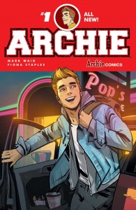
I grew up with two genres of comics: superhero comics and Archie comics. Over time I moved on from Archie and focused mainly on superhero comics because at some point I wanted more. I wanted to see character growth and change. While superhero comics have had numerous problems with that and seemed to move at a snail’s pace, it was certainly more than Archie Comics’ never-changing status quo. Since the acclaimed success of Archie Comics’ horror titles, it was only a matter of time before the publisher’s main title and character got a revamp as well and with a creative team like Mark Waid and Fiona Staples, it’s no wonder Archie #1 has been hyped ever since its announcement. After reading this first issue, I realized everything that was missing in Archie that made me lose interest when I was growing up is present here now.
The slate has been wiped clean in this new world and Waid and Staples did well to set the stage for these all-too familiar characters in a way that feels classic and fresh at the same time. This a great issue for both new and old readers. It’s only one issue in but the story is told so well that you can already tell that these characters are much more depth and can grow. Although it’s only the first issue, seeing the characters and the potential for more character depth is really exciting.
In a t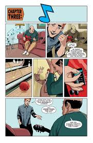 ypical 80’s/90’s high school story fashion (I’m reminded heavily of Zack Morris in Saved by the Bell and Ferris Bueller in Ferris Bueller’s Day Off), Archie takes the time to break the 4th wall in order to catch us up with what’s happening in Riverdale. Although it’s seems like a cheesy storytelling tool, it’s a great way to get introduced/reintroduced to the characters. Archie is an average guy whose love life is the hot topic at his small town high school. Betty Cooper is the ultimate girl-next-door and one of his best friends since they were five. Jughead is the food-loving, laid back friend who’s concerned about his friends’ new relationship status. Reggie is the sleaze ball rival. Some characters get more spotlight than others but their moments do really well to capture their personalities and their relationships with others. There’s one character that hasn’t been introduced yet and that absence really cements the fact that this is a reboot and that we’re really starting over again.
Having Fiona Staples on art was the perfect choice for this reboot. In can be jarring for Saga fans but Staples is only doing the penciling so Andre Szymanowicz and Jen Vaughn’s colours do well to distance the art style a bit for this more light-hearted setting. I love Staples’ redesigns for the characters. Archie’s new look in particular is fantastic and makes me finally understand why he’d be in the middle of a love triangle (square?). The best part of the interior art is seeing the way Staples shows how Archie performs music. The facial expressions that progress from nervousness to total confidence, accompanied by broken and complete notes in the background make for an amazing splash page.
Verdict: BUY. BUY. BUY. In a medium that’s dominated by the super fantastic and science fiction, it’s refreshing to take a step back and enjoy the smaller scale stories as well. Mark Waid and Fiona Staples are an awesome team and I’m looking forward to the next two issues they’ll do together.
