Hawkeye #6
Written by Matt Fraction
Art by David Aja
Colors by Matt Hollingsworth
Letters by Chris Eliopoulos
Review by Joey Braccino
This futzing book, bro. This futzing book. I can’t even with this futzing book. David Aja returns for art duties on Matt Fraction’s universally-acclaimed Hawkeye for yet another fantastic one-and-done entitled “Six Days In the Life Of.” Clint Barton has been busy in these past 6 issues—making enemies of a vaguely-Eastern-European Tracksuit Mafia, picking up Red-haired femme fatales, acquiring a pizza-dog named Lucky, and engaging in some traditional four-colored fare in madripoor as his superheroic alter-ego, Hawkeye. In this issue alone, Clint does a little bit of all of that.
Fraction is on fire with this book. The fact that he can juggle 6 separate days—each replete with its own set of events and beats—and still manage some of the best characterization and humor in comics today is a testament to the man’s talent as a storyteller. We start on a Tuesday with Tony Stark and Clint Barton engaging in some suspenseful electronics maintenance. We move to a Thursday that features some spandex-superheroics with Spidey and Wolverine. There’s also a Monday in there, and a Friday that turns into a Saturday with the aforementioned Tracksuit Mafia. Cram a Sunday and a Wednesday in there, and you have one of the worst weeks for our hero. Fraction’s script splinters the time-line in a manner similar to issue #1, but the use of “[Insert Day] DEC [#]TH” helps the reader place events in a logical order. Of course, the broken structure of the narrative also helps create closer connections between events on, say, a Monday and a preceding Thursday than a more sequential narrative would allow.
Yeah. Fantastic narrative aside, Fraction continues the spectacular character interactions between Kate Bishop and Clint Barton. She’s so rad.
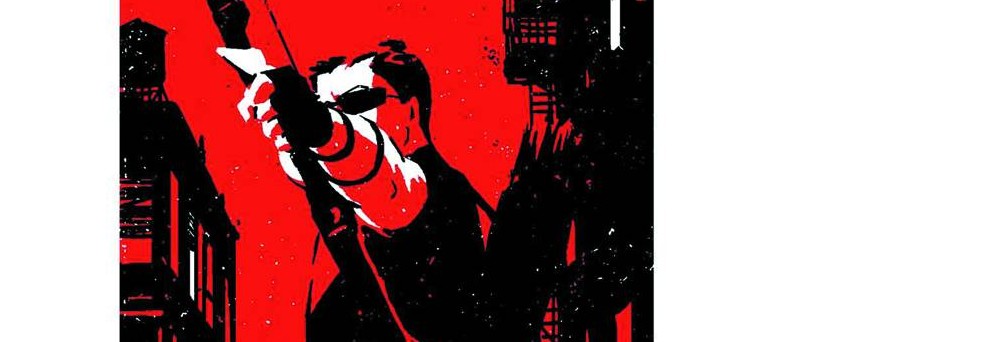
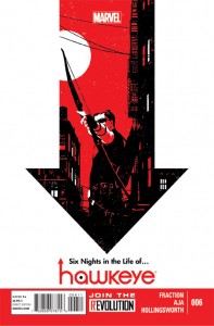
David Aja. David Futzing Aja. One of the reasons Fraction’s complex narrative works so well is because David Aja can fit so much story into each and ever panel. Aja employs some of the most unique panel lay-outs I have ever seen in the comics medium. From widescreen panels that stretch across a single page to small 1”x1” decompressed boxes, Aja’s lay-outs turn a complex script into a complex series of sequential artwork. The sequence featuring Wolverine, Spidey, and Hawkeye taking on AIM terrorists looks uncannily like a ‘90s side-scrolling videogame, replete with tiny-head thumbnails at the top. Later in the book, there’s a gorgeous, emotive full-age spread featuring a lone Hawkguy standing in the snow with a bow. It’s brilliant, and it’s exactly this sort of versatility that makes David Aja one of the best in the business and, by extension, Hawkeye one of the most visually engaging books on the stands. Also, I’m 87.3% sure colorist Matt Hollingsworth has to go out and buy more purple after working on an issue of Hawkeye.
Verdict
Buy this (obscene gerund) book. Heck, it’s still early; buy the whole darn series to date. It’s superheroics on their day off, with all of the baggage and anxiety that you would think that would entail. It’s also damn funny; how many ironically dated references can Matt Fraction fit into one book!?