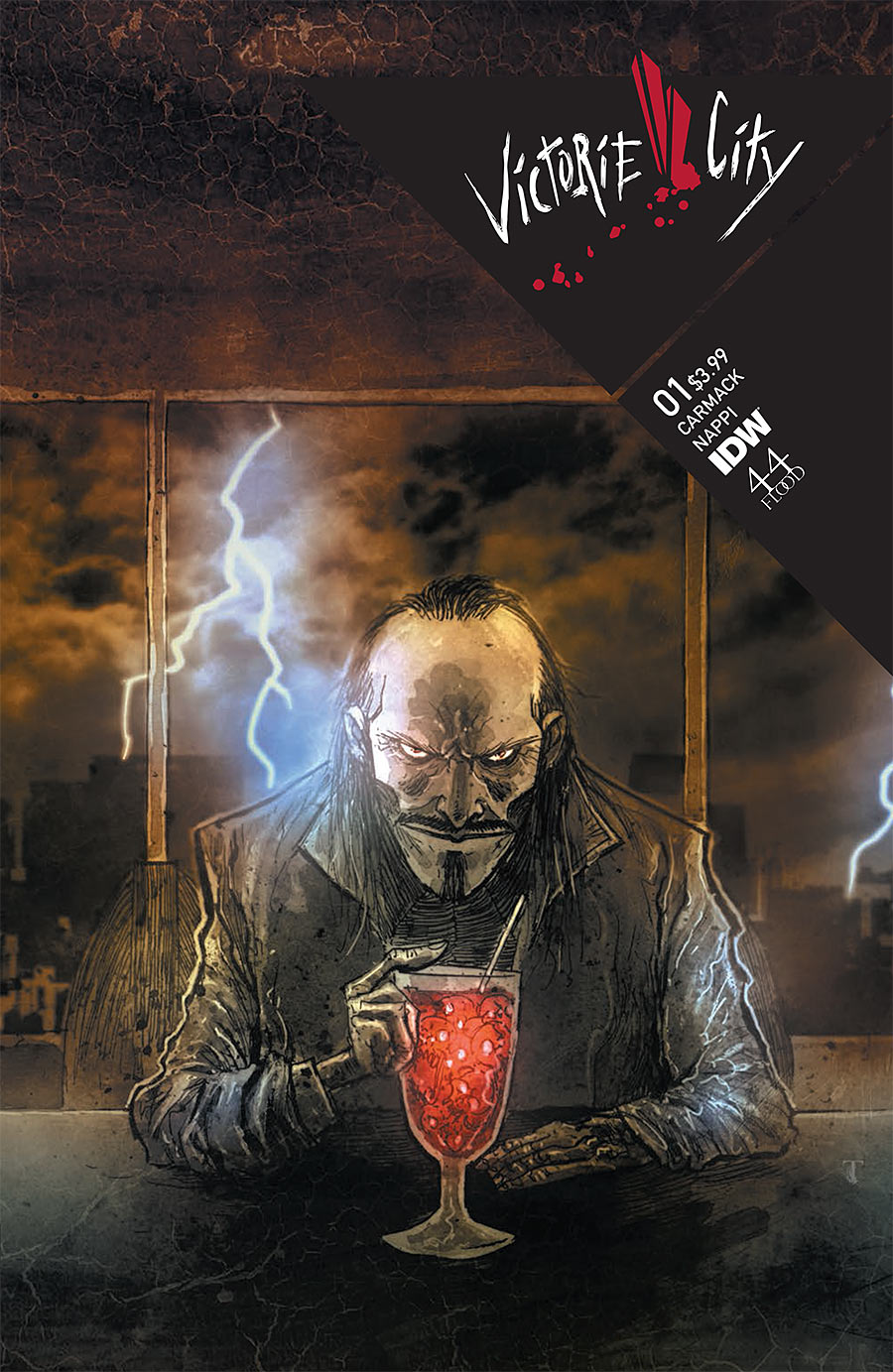
Victorie City #1 (of 4)
Story by Keith Carmack (@keithchaos)
Art by Vincent Nappi (@Vincent Nappi)
Letters & Design by Jessi Adrignola (@jessinaislost)
Review by Joey Braccino
“YOU’RE THiNKiNG TO YOURSELF RiGHT NOW THAT SOMEONE WiLL SHOW UP LAST MiNUTE AND SAVE YOU…”

Tell me if you’ve heard this one before: We open in a diner and the cook behind the bar is chatting up the customer telling him about his ungrateful son when the customer asks if he knows what infanticide is.
It’s funny, but it’s not, and Keith Carmack and Vincent Nappi’s new mini-series Victorie City from IDW is certainly twisted and brutal in exactly the same way. The scene shifts immediately to that same customer tormenting a couple 15 miles outside Victorie City, musing over the corruption in the police and government and the hopeless screams of his victims. The scene ends with giant “HA HA HA”s painted in stark red spiraling out of the man’s violent actions.
And that’s just the first few pages of Victorie City #1. Very much in the vein of films like Se7en and Silence of the Lambs, Victorie City hits all the marks of a solid psychological crime thriller. After Carmack and Nappi introduce us to the violent “antagonist,” they quickly shift focus to Detective Hektor Ness, the one good man left in a world of crooked cops. Ness is our “protagonist,” the hero who must decide whether his keeping his morality is worth losing his livelihood. As the story of Victorie City unravels, Carmack and Nappi bounce back and forth between these two men, blurring those labels and putting them on a crash course that collides at issue’s end in particularly intriguing fashion. Needless to say, I’m pumped for issue 2.
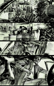
Carmack’s story moves along briskly, but the characterization is sudden and stellar. The artwork from Vincent Nappi is simply stunning. Similar to cover artist Ben Templesmith’s moody aesthetic, Nappi’s scratchy, disorienting lines and layouts convey the complex and distressing psychology of the narrative expertly. Think Hunter S. Thompson meets Sean Phillips, with all the surrealism-comme-noir that you could mix in. One of the more brilliant artistic choices of the book is the use of color: Ness’ storyline is painted in a soft greenish hue while the serial killer’s scenes are washed in a grey/blue; when the two stories merge at the end, Nappi literally mixes the two color tones together into a gorgeous and shocking double-page spread. On top of that, Jessi Adrignola’s letters and design contribute abundantly to that distressing tenor of the book. The uneven, haphazard lettering reflects those same notions of uneasiness and insecurity, and it all comes together in a truly stunning visual experience from cover to cover.
Verdict
Buy. Brutal, bare, and beautifully crafted, Victorie City is a pitch-perfect combination of style and substance. Keith Carmack’s tale of corruption—both literal and figurative—is captured brilliantly in Vincent Nappi’s evocative artwork and Jessi Adrignola’s phantasmagoric design. Check it!

