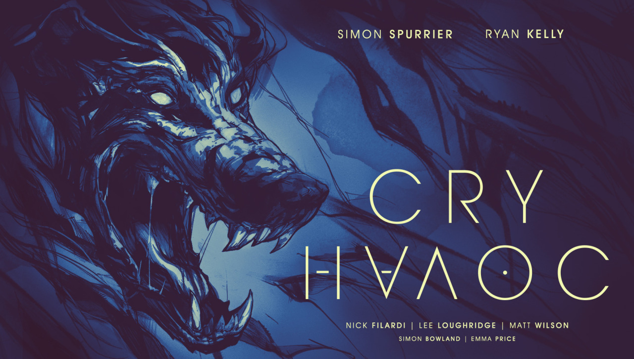
Cry Havoc #1
Writer: Simon Spurrier
Artist: Ryan Kelly
Colorist(s): Nick Filardi, Lee Loughridge, Matt Wilson
Letterer: Simon Bowland
Designer: Emma Price
Cover Artist(s): Ryan Kelly, Emma Price
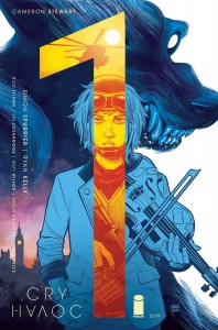
Variant Cover: Cameron Stewart
Review by Caelin Gunther
 After you read my extremely thoughtful and well written review, you can also check out an interview with Cry Havoc’s writer Simon Spurrier by Talking Comic’s very own C.J. Thompson! (http://talkingcomicbooks.com/2016/01/26/cry-havoc-an-interview-with-si-spurrier/)
“Cry ‘Havoc!’, and let slip the dogs of war.” a line from Shakespeare’s Julius Caesar and the first thing I thought of when I first saw this book in previews, and I’ve been excited about it ever since. Having little to nothing (and yet also something and everything!) to do with that line from that play you were forced to read in high school, Cry Havoc comes fresh off the Life is Strange blue haired lesbian hype train to bring you easily the best comic book I’ve read this year so far. Even as I try to type this review I’m barely able to hold back my inner fangirl from glazing the home row of my laptop with thoughts of myths spanning various cultures, and that damn sexy British slang.
We open at the close — it literally says “The End.” — (shhh I’m only a little into Harry Potter) with our hero, a lovely blue haired lassie named Lou locked in a cell looking — I guess we’ll say “not the healthiest”. But we should back up a ways, mostly because the next page of the comic says “The Beginning.” I feel like that’s a good indication of a temporal shift to the past. It’s here we officially meet Lou (in considerably better shape) meeting her girlfriend (the cool kind), a zoo keeper who is angrily staring at a female hyena’s extended pseudopenis. It’s during this awkward lunch that Sam (the annoyed girlfriend) explains some facts and stories about hyenas. It’s also here that Spurrier begins to flex his writing prowess with not only foreshadowing, and good research, but the ability to subtly give depth to his character’s and their relationship. Sammichs thoroughly ruined, we’re thrown into “The Middle.” which, coincidentally or not, is in the Middle East. If by this point the book hasn’t already sunk its teeth into you, The Middle will do that quicker than a line gun can ‘splode a billygoat. The transition is sharp and sudden highlighted by a striking change in color pallette (more on that in the art section of this review) and an overt change in mood. It’s much more tense in The Middle, and not just because it’s a warzone, Lou is noticeably more anxious, her growing confusion increasingly shown by her expression and dialogue (honestly, she’s probably handling it better than I would). She explains to her party what transpired to get her here in another flashback as jarring as the flash forward was. Not to give too much away, she was mugged by a werewolf (intrigued yet?!). After landing at a former US Blacksite Lou’s mission to track down Lynn Odell, a “consultant” for the US government gone rogue, is explained. She finds Lynn, and she gets the answers she seeks and a ticket back to her normal life. Things go… Not as planned… Transported back to The End we find that the real end to this modern fairy tale may be further away than we think.
Omigosh finally! I get to talk about the art! It’s so good you guys! First a note that Emma Price is some sort of magician. Not only is the cover great, but when I saw on the inner cover that there was a specific credit to Emma for design I was like “that’s a credit I haven’t really seen before, I wonder what that’s all about”. It was only after finishing the book and reading Spurrier’s notes that I understood. Not only is the color pallette different in every section of the issue, but the panel layout and the way the scenes were structured were different as well. It’s subtle, but after a second read through it makes all the difference.
While we’re giving credit where credit is due, Ryan Kelly’s art in fantastic. It’s extremely expressive and the refined linework makes me tingly in my bits. When Kelly is drawing a character, every part of that character’s body is saying something and it adds so much to a scene. Even the posture in the animals shows dedication to studying the way a body moves and expresses itself.
And last but certainly not least, the three color wizards of this book: Nick Filardi who is on his blue period and bled all over the vibrant London scenes, Lee Loughridge whose Phantom of the Opera face shadow phase ran red the scenes in the cell, and Matt Wilson with scenes that literally exuded a dry heat that made me never want to travel to the Middle East (in a good way). I don’t know how many hours these guys deliberated over what colors to use and how, but it was time well spent. The transitions are stark and jarring and vibrant, and yet they fit together and compliment each other so perfectly. The art alone makes this book an experience to be desired.
Verdict:
BUY! Buy like you could travel back in time to when Apple stock was cheap!
I’ve typed and immediately deleted so many cliched review catchphrases: “thrilling” “flawless” “supercalifragilisticexpialidocious” etc etc. None of them quite capture how I felt when I finished reading the book which was genuinely and markedly excited. Excited to my bones. I get that from so few comic books these days, and it’s something I’ve learned to head. Like the nagging creeping sensation that if you look behind you something will be there in the shadows ready to gobble you up (spoilers: it’s a good story). It’s a gut feeling that we all too often ignore for the sake of a pseudo-intellectual sense of snobbish superiority and a logic that can never truly understand anything but that we cling to anyway. Maybe I’m biased, I love the themes and the content, I’m a sucker for the myths, and I’ve definitely got art goggles on, but all these sound like cool things to have in a comic book anyway so shut up. I urge you to listen to your gut when you check out this book, or if your gut has bad taste, listen to my gut, you won’t be disappointed. This is one of those books to pick up, even if you’re on a tight budget, maybe this is the day you drop a series that hasn’t been doing it for you lately in favor of a new and exciting book.