Hawkeye #15
by Matt Fraction and David Aja
Color Art by Matt Hollingsworth
Letters by Chris Eliopoulos
Review by Mike Duke
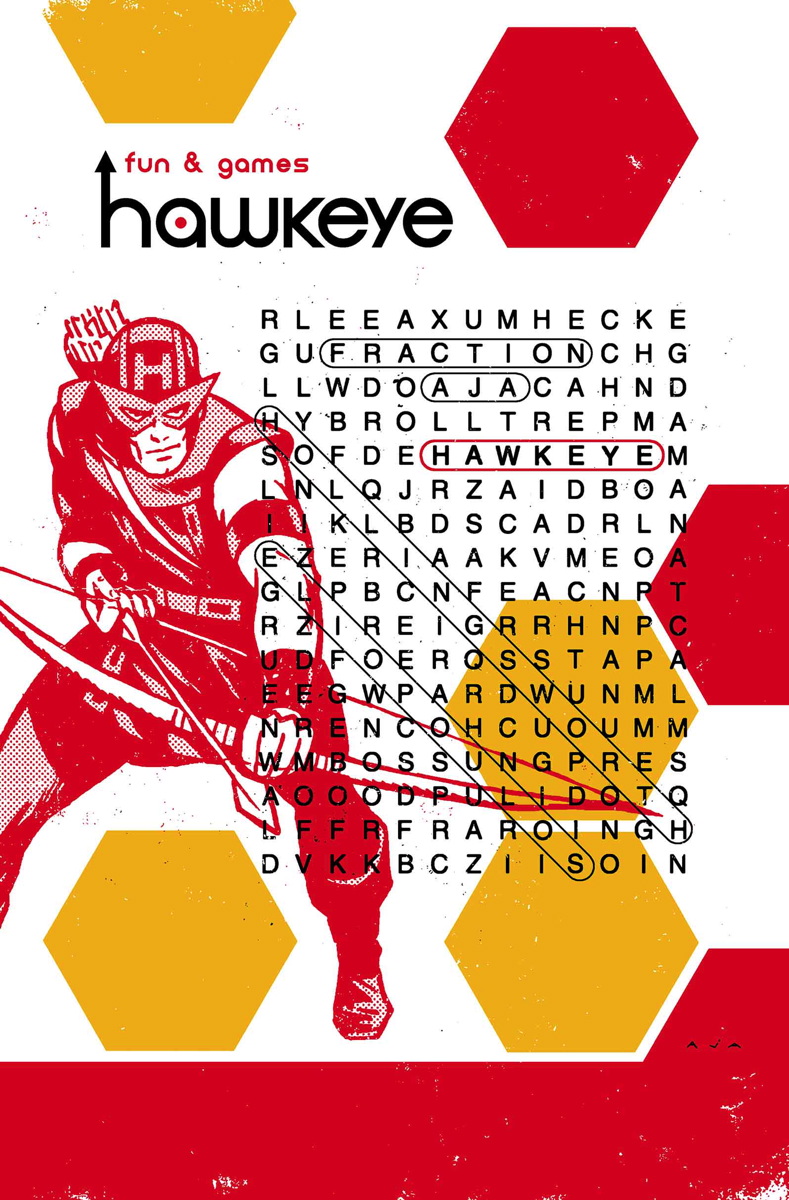
Okay, let’s address the elephant(s) in the room: yes, the issue of Hawkeye that came out this last week was issue #15, while the issue that came out in January was #16. Yes, the last four issues have really similar covers–so much so that I’ve been getting them confused, what with all of the red and yellow hexagons. So yeah, I had the annual and the last four issues saved up to read all at once and I got a little confused. The good news, however, is that all of that is really the only problems that this title has. All the rest is kick-ass art and fun and yet emotional story.
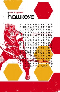 Part of the reason for the weird numbering is that since Kate Bishop left for Los Angeles, the even issues have been Kate-centric while the odds are dedicated to Clint Barton. Issue #15 is a Barton issue in which he cannot keep his pants up. Literally. Clint is also tracking down the tracksuit mafia while they are tracking him. It seems that, while the apartment building is under Clint’s protection, it’s not exactly under his ownership. As Clint and his brother get closer to Grills’s killer, the tracksuiters realize that the Bartons can’t really call the cops. It all comes to a head in the last few pages, leaving the story on a huge cliffhanger. Fortunately, it looks like the numbering is back on schedule for March, so we should find out what happens with the Hawkguys pretty soon.
Hawkeye is so different than anything else either of the big two are publishing, it’s seems unfair to compare it to other comics. It’s more like my favorite TV show: the character are endearing, the plots are constructed more like a TV show than a comic, and Fraction and Aja’s visual sense and style are head and shoulders above most of the comics out there right now. It really is a singular experience in the medium.
I suspect that some of the mixup with issue numbering is also due to a delay with art since David Aja is still drawing the Barton issues but not the Bishops. But don’t quote me on that. Either way, it’s great to see the unique style that Aja has created for Hawkeye continue, and it’s only getting better. I have to say, also, that I’m really enjoying Matt Hollingsworth’s colors. He’s managed to maintain the color palette that we have come to expect from this series, but each different location has an additional tint to it that makes the scene visually unique from the others, helping to keep the reader clued into where we are at any given moment. As always, Eliopoulos’s lettering is excellent, but I also want everyone to check out the upcoming Hawkeye #18, in which Eliopoulos will be on art duties. He’s a wonderful cartoonist, whose work you can see on the variant covers of Battlestar Galactica and The Shadow/Green Hornet crossover at Dynamite. You can also check out his now retired webcomic, Misery Loves Sherman, at miserylovessherman.com
Verdict
Buy it. If you’re not getting Hawkeye at this point, you are really missing out on a completely unique experience in comics. To say that there is nothing like it–which I have already said–is an understatement. The current arc started with Kate leaving for LA in the Annual last year and continues in issues #13 through #16 so far. They read very well either as back-to-back stories or as every other issue bouncing from east coast to west coast. Either way, it’s some of the most fun you can have with paper and ink.

