Justice League #23.2: Lobo
Written by Margurite Bennett
Art by Ben Oliver with Cliff Richards
Colors by Daniel Brown
Review by Mike Duke
I’m confused. Apart from the question of the value/necessity of Villain’s Month and outside of the question about bringing Lobo into the New 52, I’m confused about this book. Combine an unrecognizable character redesign, a complete removal of the humor that so many fans enjoyed, and some issues with the execution of the issue itself, and this installment of Villain’s Month is a total non-starter.
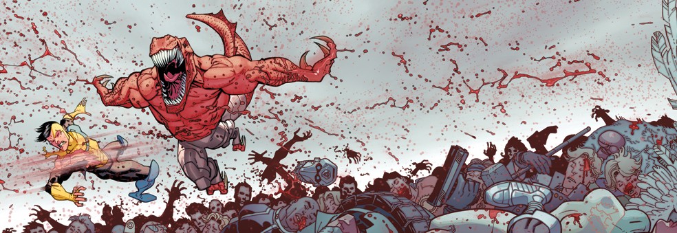
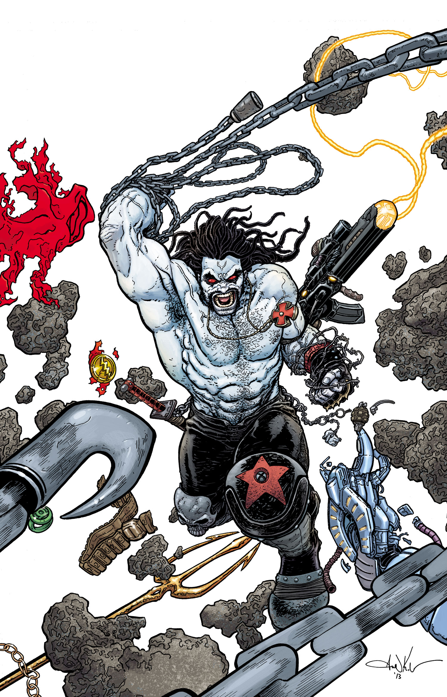
The cover features the Lobo that I recognize, and I assume that is the case with many readers. However, by the second page inside the book you will find someone else entirely. He’s lean, he’s sporting an Elvis-style pompadour, he has strange glowing blue things on his face and shoulders; he is, in short, a different character. And again, I don’t get it. If you’re going to redesign a classic character like this, put him on the cover! Put him on the internet! Put him out there so that when your readers open the book they don’t do like I did and go, “Wait, which one is he?”
I’m not a Lobo fan, but I’ve always thought of the character as funny. Like, a cross between Deadpool and Andrew Dice Clay kind of funny. This may not have been the case for the character’s origin, but that’s the Lobo I remember. That is not, however, the Lobo for Villain’s Month. This Lobo is nearly humorless, and if I’m being honest, nearly devoid of personality all together. He talks tough, filling caption boxes with cliche anti-hero dialog. He kills things, but even that seems anti-climatic. The only moment to pique my interest was in the last two pages, but not only did it feel like too little too late, it was yet another confusing decision on top of 20 pages of the same.
I do have a couple of positives. First, this is my favorite 3D cover so far. It’s the perfect balance between interesting objects and simplicity to make the added dimension work the way it should. Also, I did enjoy the art inside the book. Ben Oliver and Cliff Richard have created a cool, sketchy style that brings this universe with all of its various aliens to life. Unfortunately, the cover and art just weren’t enough to salvage this completely confusing take on the character.
Verdict
Skip it. This issue is clearly meant to lead into something more after Villain’s Month, and there might actually be enough here to make that interesting, but to make it worth while would require a new writer and a better sense of where this story is supposed to go. Until then, there are better books out there to enjoy.