Hawkeye #4
Written by Matt Fraction
Art by Javier Pulido
Colors by Matt Hollingsworth
Letters by Chris Eliopoulos
Review by Joey Braccino
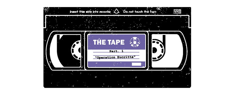
Talk about a cold open. Hawkeye #4 eschews a recap page in favor of a shocking, scandalous, hyper-violent screen cap from a super-secret, super-awkward VHS tape. I won’t spoil anything here, because you should really be reading Hawkeye by now, but the tape becomes the central device on which this first issue (in a two-part story-arc) hinges. Clint Barton is in international, geo-political trouble due to the contents of the tape, and he embarks on a dangerous mission to Madripoor to retrieve it from the criminal underworld.
As has become the norm, Matt Fraction’s script is brimming with quips, pop cultural references, and rapid-fire dialogue. Even though this issue starts the first multi-issue arc, Fraction weaves in several elements from the previous three one-and-dones. Kingpin, Madame Masque, and a few other super-villains from back in issue #2 make appearances this week, suggesting a larger mythos for his Hawkeye series. Apparently, Clint Barton has decided to run afoul of all the major criminal masterminds in the Marvel U, despite, as he points out early in the issue, his lack of powers. I’m just waiting for Pizza Dog and the Tracksuit Mafia to get involved in this multi-party tape-fiasco.
David Aja is off Hawkeye for the “Tape” mini-arc. Artist Javier Pulido tries his darnedest to match David Aja’s innovative lay-outs and transitions, but he unfortunately falls short. Pulido’s linework is reminiscent of Jack Kirby and Steve Ditko’s early Marvel work—kinetic, simplistic lay-outs with thinner-than-genre character designs. Matt Hollingsworth’s flat washes typically accent David Aja’s pulpy artwork, but here they further the “vintage” feel of Pulido’s figure work. I’m sure most will enjoy the traditional feel of the imagery, but, unlike Aja’s work, there really isn’t much going on in the panels to really engage the eye. While there isn’t necessary anything wrong with Pulido’s artwork, it still does feel like a step down from Aja’s visually stunning work on previous issues, which, in all honesty, was the real selling point for this series from the beginning.
Verdict
Check it out! Fraction provides readers with exactly the sort of much-needed superheroics-sans-tights pulp yarn that helps to expand the genre beyond capes and supervillains. It’s unfortunate then that Pulido’s artwork invokes comparisons to traditional Silver Age comics. Despite this slight lapse in art quality, Hawkeye remains one of the best comics on the stands.