With the release of The Avengers this past weekend, superhero movies have been on my mind quite a bit. I did notice, however, that in the final one sheet for The Avengers that Tony Stark’s head looks horribly photoshopped onto Iron Man’s body and that the poster as whole, while cool, is not nearly as badass as some other superhero movie posters of yesteryear.
That being said, I compiled a list of what I believe are the 10 best (and 5 worst!) superhero movie posters of all time. Here we go!
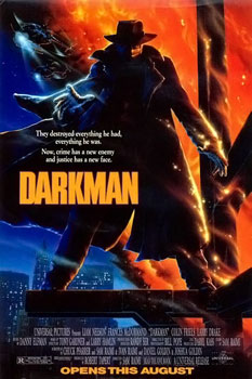
10. Darkman (1990)
Sam Raimi’s fun, dark, twisted and weird comic book tale comes to exceptional life in this one sheet. An ad campaign that asked “Who is Darkman?” peppered comic books, movie theaters and bus shelters in the summer of 1990 (this was my first R rated movie in the theater … as a six year old) and this poster made the unknown seem super cool.
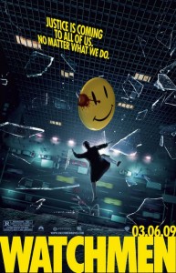
9. Watchmen (2009)
When fanboys began to retaliate against the adaptation of one of the greatest comic book stories ever told, I’m sure this poster satiated them just a bit. By putting the bloody smiley face pin front and center it reassured fans that the iconic imagry of Alan Moore’s graphic novel would be maintained and respected. Plus it just looks so damn cool.
8. The Shadow (1994)
As this list goes on, you’ll see I have a penchant for minimalism. Some hate this film, some love it, but nobody can deny the simple, effective image that artist Mike Kaluta gave us for this poster. It shows a comic book version of the character and asks “Who knows what evil lurks in the hearts of men?” What more could you want?
7. Superman Returns (2006)
There are a few teaser posters on this list, and I think that this poster effectively evokes nostalgia in all of us. We don’t need to see Brandon Routh’s face (yet), we don’t need a cast list. We just need to know that Superman is coming, and what better way than to put an S symbol on a blue background. The final posters were much weaker, but the excitement this invoked in me will always be cherished.
6. The Punisher (2004)
Here’s another teaser poster, which you can see by the release date at the bottom (the film wound up opening in April). Just as with Superman Returns, this poster gives us the famous symbol of the character and in a fresh way with the red background. Unfortunately, the poster promised bigger things than the movie delivered. But that’s what advertising and marketing are all about, aren’t they?
5. Spider-Man (2002)
High-flying joy. This poster, for the first hugely successful Marvel comic book film, gives us what some of these other simpler posters don’t — our hero in action. The poster promises that you are going to see an authentic-looking webcrawler slinging across Manhattan, and you better strap in tight. It earns the number 5 spot because it still makes me smile to this day.
4. Captain America: The First Avenger (2011)
This isn’t the newest film on this list (read on!), but it deserves its place here because it goes where some posters are too afraid to go — dark. He is Captain America, and he is USA personified. Squeaky clean, red white & blue — we get that. But to see him with his eyes closed surround by the shit going on is an incredibly effective way to show that he is going to have to go through some rough stuff to come out on top. The placement of the shield is perfect, and Evans looks just pissed off enough.
3. The Dark Knight Rises (2012)
This is the first teaser poster for the film that comes out this summer and we haven’t seen a final one-sheet for it, but Warner Bros. will be hard-pressed to top this. It’s a perfect juxtaposition of the film’s title — the sky is falling, people. Christopher Nolan’s bat symbol rising out of the sky into white is haunting and beautiful at the same time. This will be an epic story, and this creates even more anticipation for me.
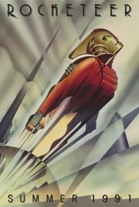
2. The Rocketeer (1991)
This is one of my greatest movie memories, going to the theater as a kid and asking my dad what a “rocketeer” was as I saw this poster displayed. I saw it for my 7th birthday party and it still holds up to this day. But we’re not talking about the movie, we’re talking about the poster. For a film that’s about a technological revolution, the art deco style is a brilliant choice on Disney’s part. It elicits thoughts about the future for a film that is set in the past, and captures the essence of Dave Stevens’ kickass hero perfectly.
1. Batman (1989)
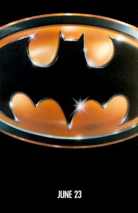
This is the superhero movie poster. Nothing beats this. Nothing can ever beat it. In fact, as I type, a friend looked over my shoulder and said “you can’t fuck with that poster.” No you can’t, Rob. No you can’t. Batman could have had an image of Michael Keaton as the Dark Knight or, more likely, one of Jack Nicholson as the Joker as its selling point. But the choice to use one of the most recognizable symbols in the world (I think it’s, like, third to Coca-Cola and Godzilla) is a no-brainer, and despite the poster being almost 25 years old it doesn’t look dated in the least (check out other 1989 posters — you’d be surprised). As good as some of the Christopher Nolan Batman posters are, this one takes the cake every time.
and now for the five worst…
5. Return of Swamp Thing (1989)
A word balloon? Really? And is that supposed to be a smile on Swamp Thing’s face or a grimace? And why is the girl slyly posing for the photo? This one’s just weird. No wonder it made no money.
4. Steel (1997)
There’s a hole in Shaq’s chest, and it doesn’t seem to phase him in the slightest.
3. Daredevil (2003)
There is an original poster for this film that looks exactly the same, just with Daredevil by himself. That one is decent, at best. This one, however, puts all four major characters together. On one rooftop. Why? Shouldn’t they all be fighting instead of posing?
2. Superman III (1983) Just look at it. 1. X-Men: First Class (2011)
 I still don’t believe this is real. It looks like two Fox marketing guys got into a drunken bet of “who could design the most sophmoric poster” and this is the result. I could do better work in Microsoft Paint. Thankfully, the film far exceeds the pedigree of these posters. Let’s hope Fox goes a different way next time around.